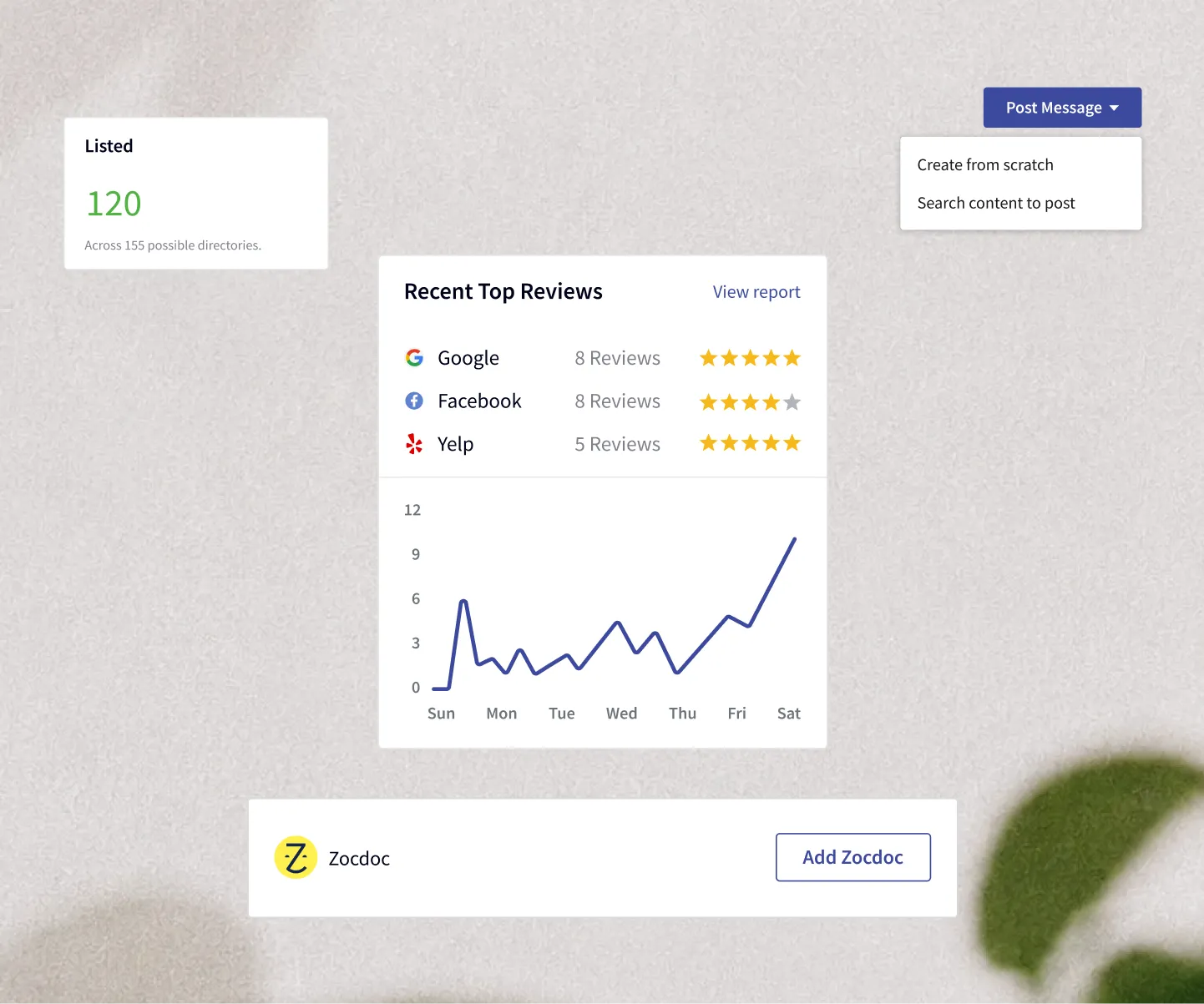
The project
Nichepractice is a digital presence management platform focused on clinics and private healthcare providers, so they can effectively market their practices on the web.
My Role
I was the only Product Designer working on this project, along with one Project Manager. The PM was majorly responsible for product placement, feature discovery, and communicating the technical feasibility of solutions.
I was also involved in conducting user research, preparing interview questions, surveys, and usability test scenarios, and ran workshops for alignment and prioritization. This helped in synthesizing the requirements and putting user stories in the right matrix.
Problem discovery
While conducting early interviews with our potential users (dentists and healthcare professionals), many of them expressed difficulty in maintaining a consistent marketing effort, brand voice, and social presence while managing their day-to-day and professional duties. Initially, they went to list their business online, made websites, and started campaigns, but all of this was hard to manage across multiple platforms.
People are finding it hard to maintain their social presence using different marketing tools.
There were many tools out in the market, and they all helped run one aspect of their social presence. We asked ourselves: how can we help this industry, which needs different tool sets, in one place?
How might we help healthcare professionals promote their practices?
We took this problem and started to gather information from users about what they think about it. We conducted interviews and ran a few surveys with industry professionals and new joiners. We found in our surveys that people aged between 25–45 were more eager to join the platform and were looking for a digital solution, while those in the 50–60+ bracket were reluctant to use it themselves but were looking for ways to hire someone to use it for them. The factor that led those senior practitioners to behave this way was that their practices were well-established and they were very busy in their profession. Being in the business for a long time, they had connections and could hire a marketing person to manage the system for them to increase revenue.

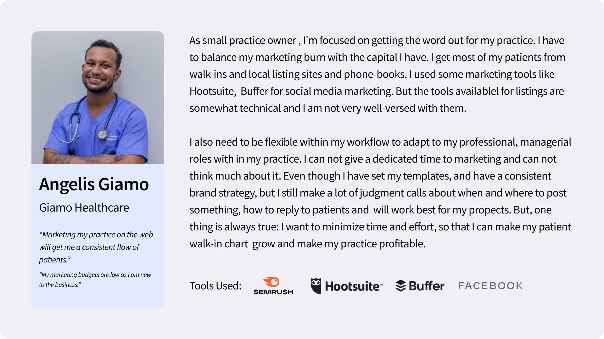
Our Ideal Persona
We figured out that the ideal persona for us would be in a specific age bracket, with a certain number of years in business and a specific locality. This helped us clarify how to look at the user for this platform and who our primary target audience would be.
Solving for the user
I, along with my PM and stakeholders, ran a workshop to keep the user at the center of our attention and start empathizing with their problems. I encouraged everyone to put as many ideas as they could, and then we voted and picked workable ideas out of them, arranged them in the form of HMWs, and grouped them into two major categories of problems that we were trying to solve for this MVP.
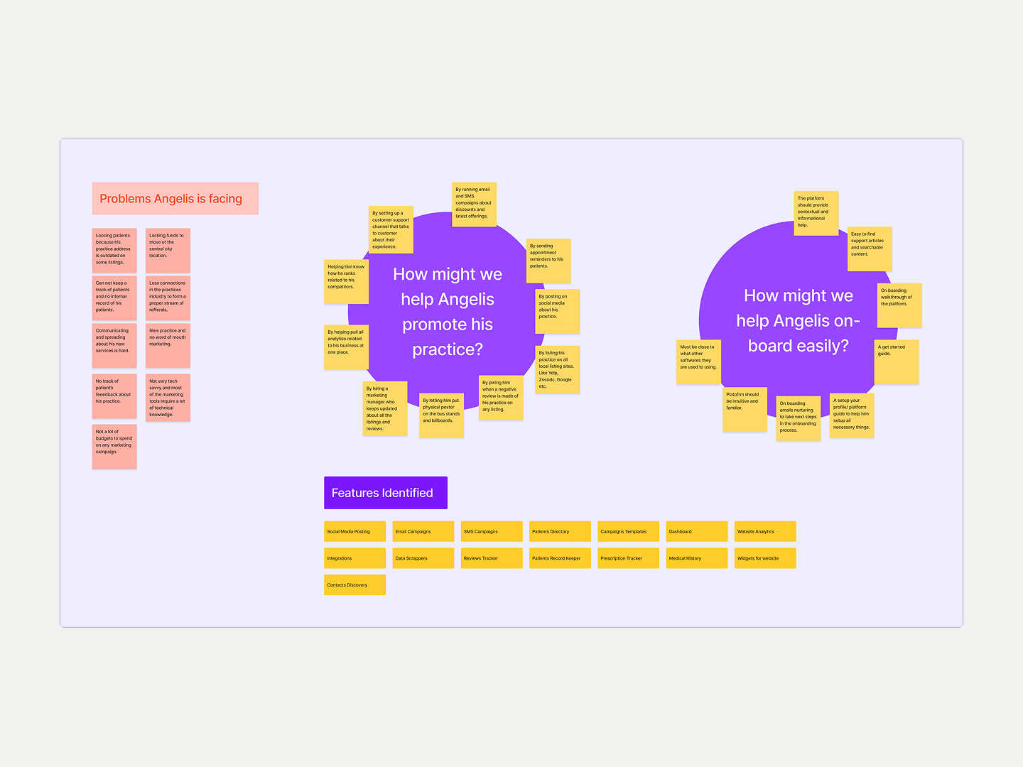
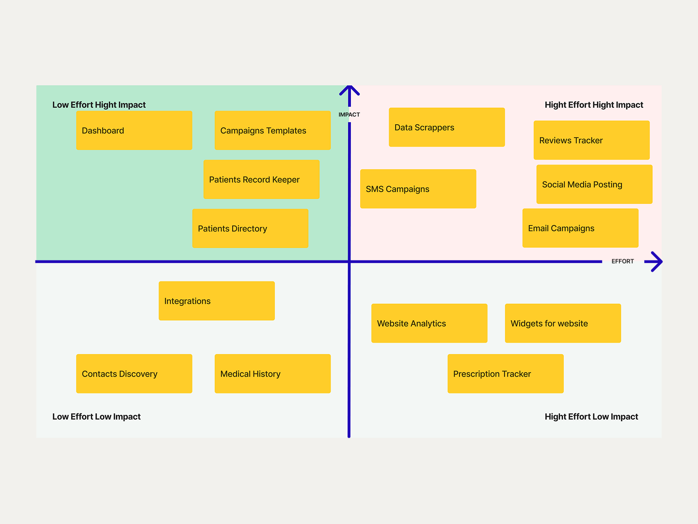
We identified and translated the HMWs into solutions that could be implemented into the product. The next step was deciding what to prioritize, as there were many features and solutions that we identified. So I gathered the team again with engineers and put the features into a priority matrix based on hitting the MVP timeline.
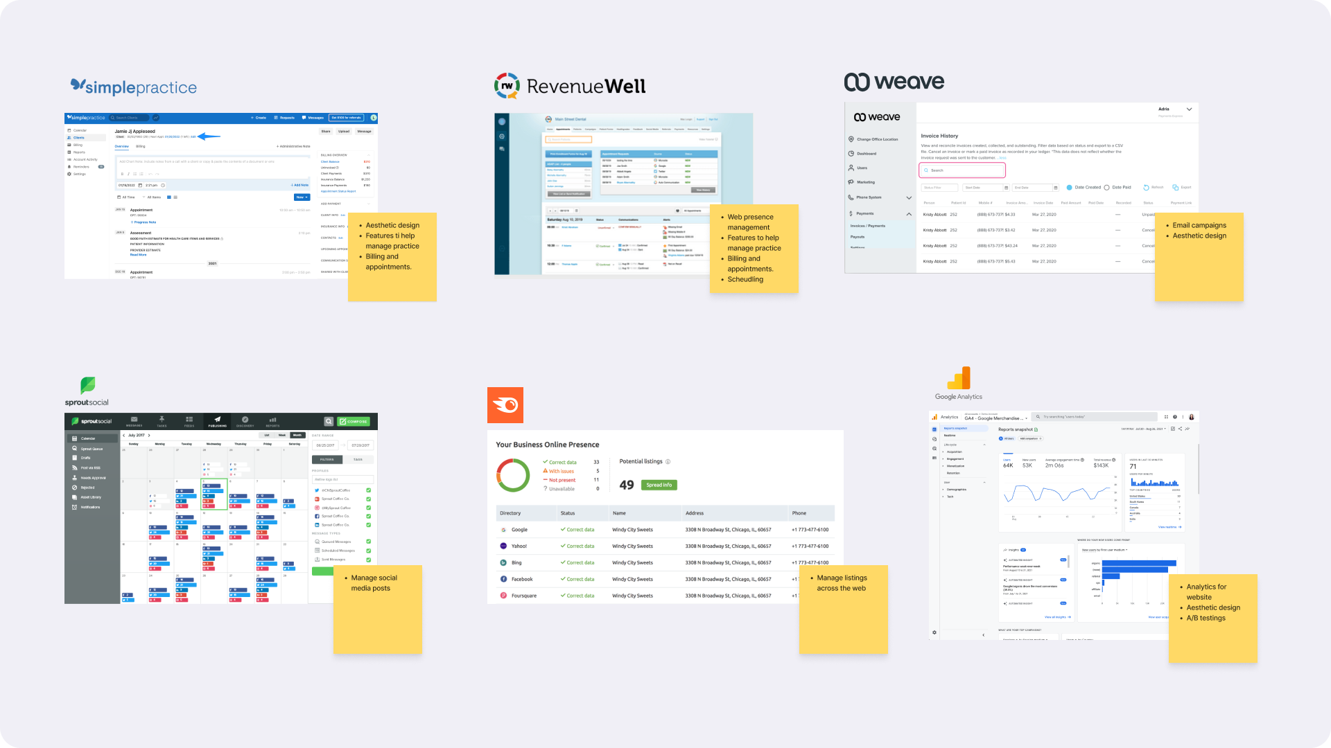
Competitor analysis
By analyzing other tools that were out there, we figured out that the features we had decided to move forward with would be a competitive advantage over other platforms. We were positioning Nichepractice as a marketing platform, so practice management was not a focus.
Information architecture
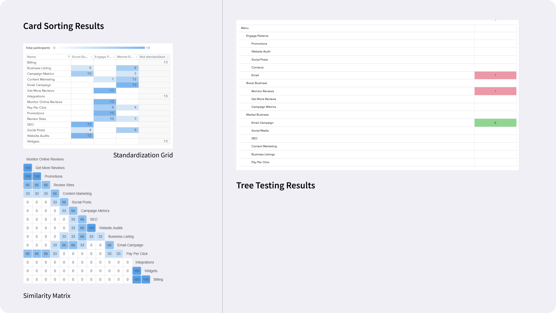
I moved my focus towards the visual and layout explorations of the platform. In the meantime, my PM and client ran a few studies along with the copywriters to perfect the IA of the platform. We had identified features, and it was time to put them in the right context for the users so they could find them easily. They shared the study results with me to keep them in focus while working on the navigation.
Baking the product
When we were confident in all the little pieces of the product and knew how all of this was going to be put together, I started figuring out layouts and components for the design.
Take Aboard
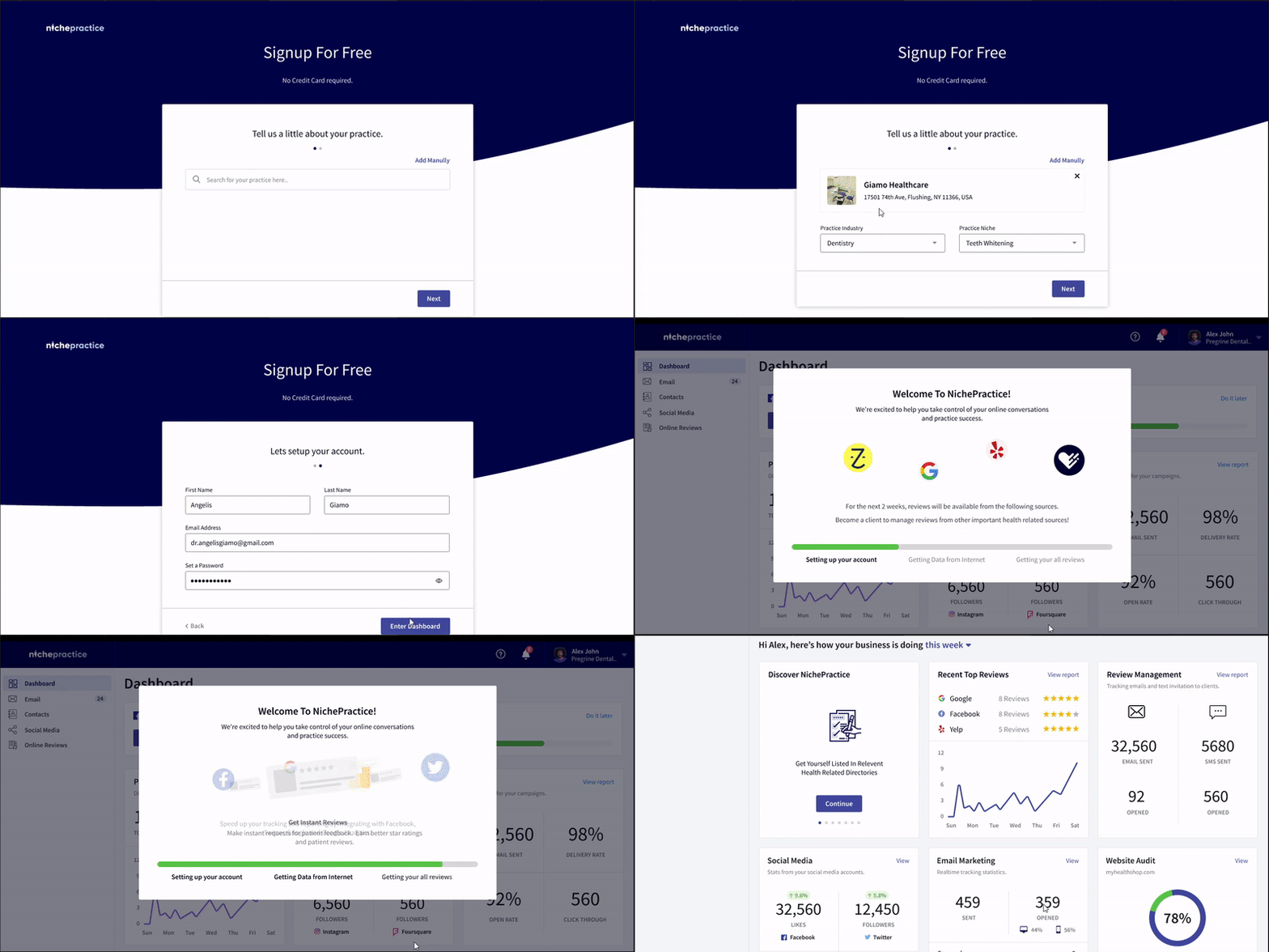
The crucial task was to onboard users instantly and get all their required information from around the web to let them get started with the platform. We found that by using SEMrush and web-scrapers we could get the required and sufficient data for the user, so that when they land on their dashboard they don’t feel alien at all.
Where to Put Navigation?
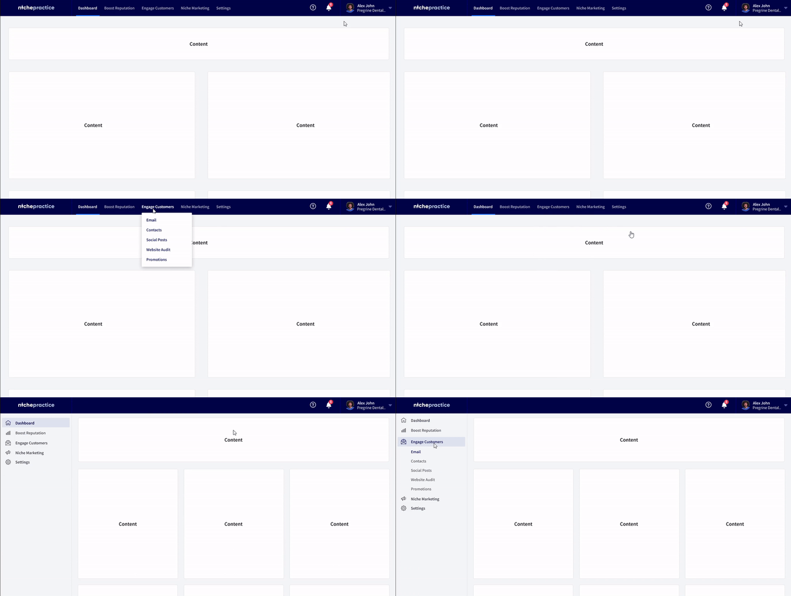
As I started working on the layout, I found one critical decision to make. Where should I put navigation? There were two options — to put it on the top of the page or on the left side. After looking at my navigation structure and information architecture, I felt that a top bar would be a little intrusive in navigating between different pages. I also looked at my user persona and figured out that they are not used to hidden information. I found that it could result in users doing miss-clicks or no clicks at all, because the effort of finding something in tray navigation is hard.
I also relied on this research by NNG that 80% of the user’s attention goes to the left-hand side of the page, and that vertical left navigations also help to find an item of interest with fewer eye fixations.
A Holistic View of the Practice
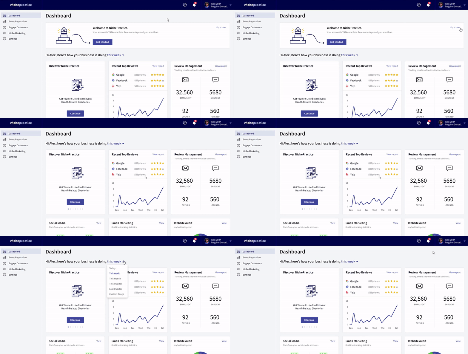
Provided there is a time when a user wants to spend time looking at the granular details, sometimes they just need a holistic view of how everything has been over a given period. We provided them with a dashboard that covers all the essential details that they can quickly skim to see if their efforts are going in the right direction or if they need to change something.
Manage Your Social Media Here
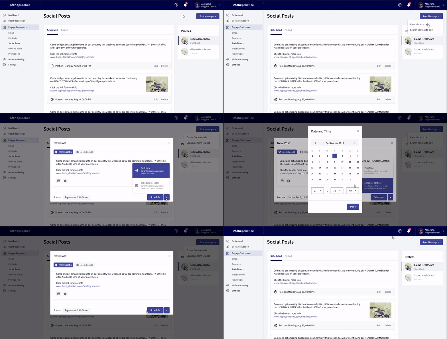
A very unique feature we were offering was a very simple solution for users to manage their social media accounts. We found in research that most practitioners and patients use Facebook and Twitter, so we set out to give users the ability to post on these social platforms from within the platform.
Giving users the ability to manage and schedule their social media posts in advance was something that practitioners loved very much. They can now set their social media posts to go out at a requested time and date — they just need to schedule it once.
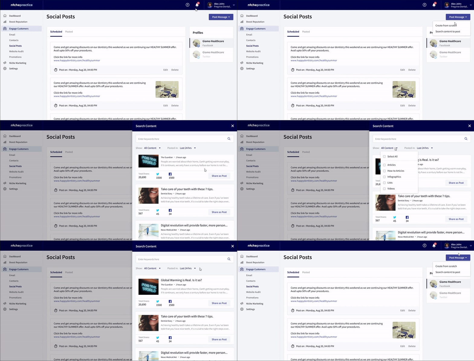
Discover content for posting. Usually, people run out of things to post on social media, and when it comes to businesses, regular posting ensures that you are in the feed of your potential customers. To help with this, we provided Content Discovery in the platform, which helps users search the latest content around the web to post.
Reviews in One Place
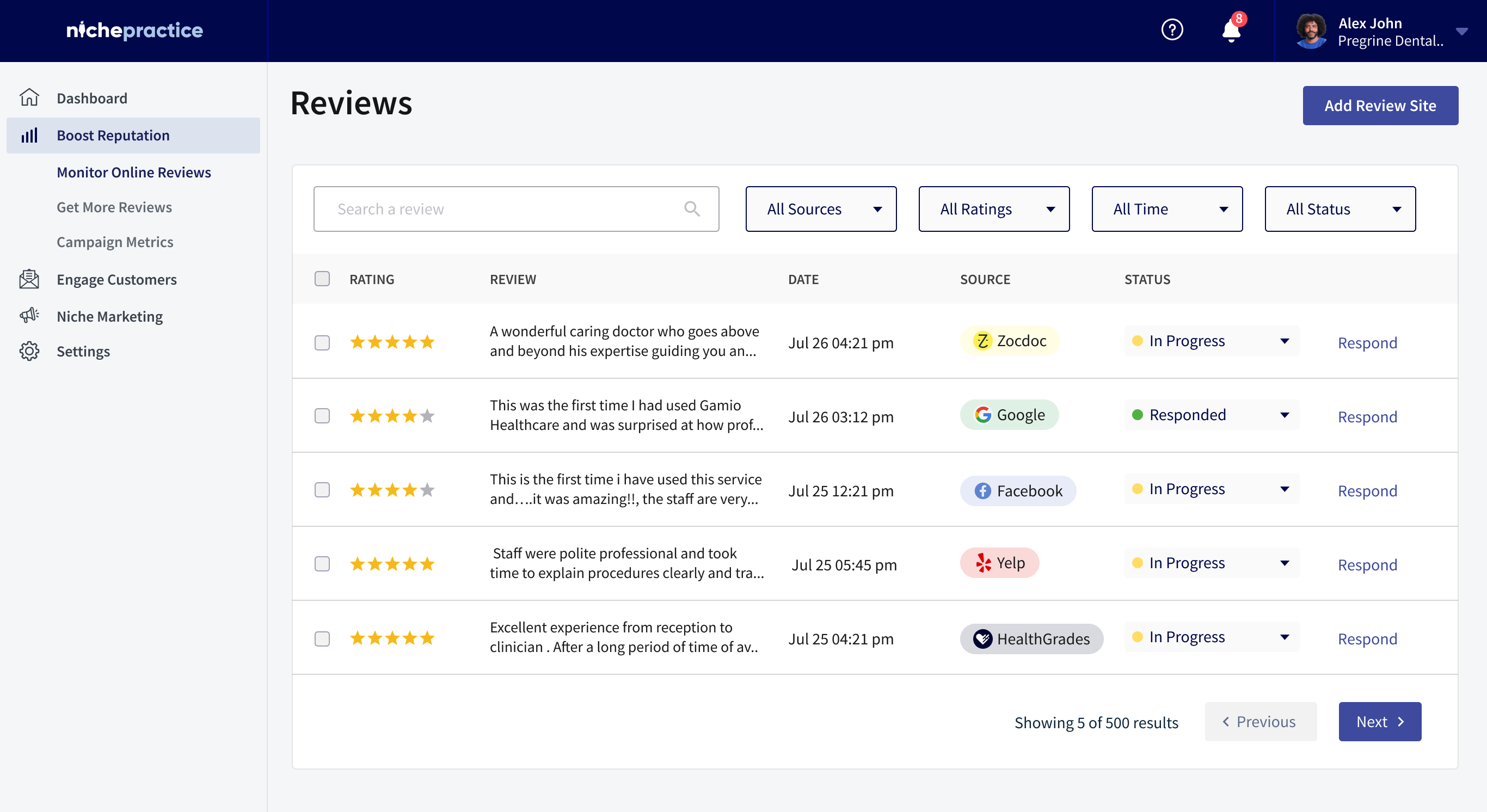
Giving practitioners all of their reviews in one place helped them know what channels or listings are active. They could easily track positive and negative reviews. This also helped in saving the business reputation if a negative review was posted, by replying to that review from the platform. Web-scrapers and other in-house APIs work to gather all reviews from different sites and post the data back there.
Listings — Gather Them
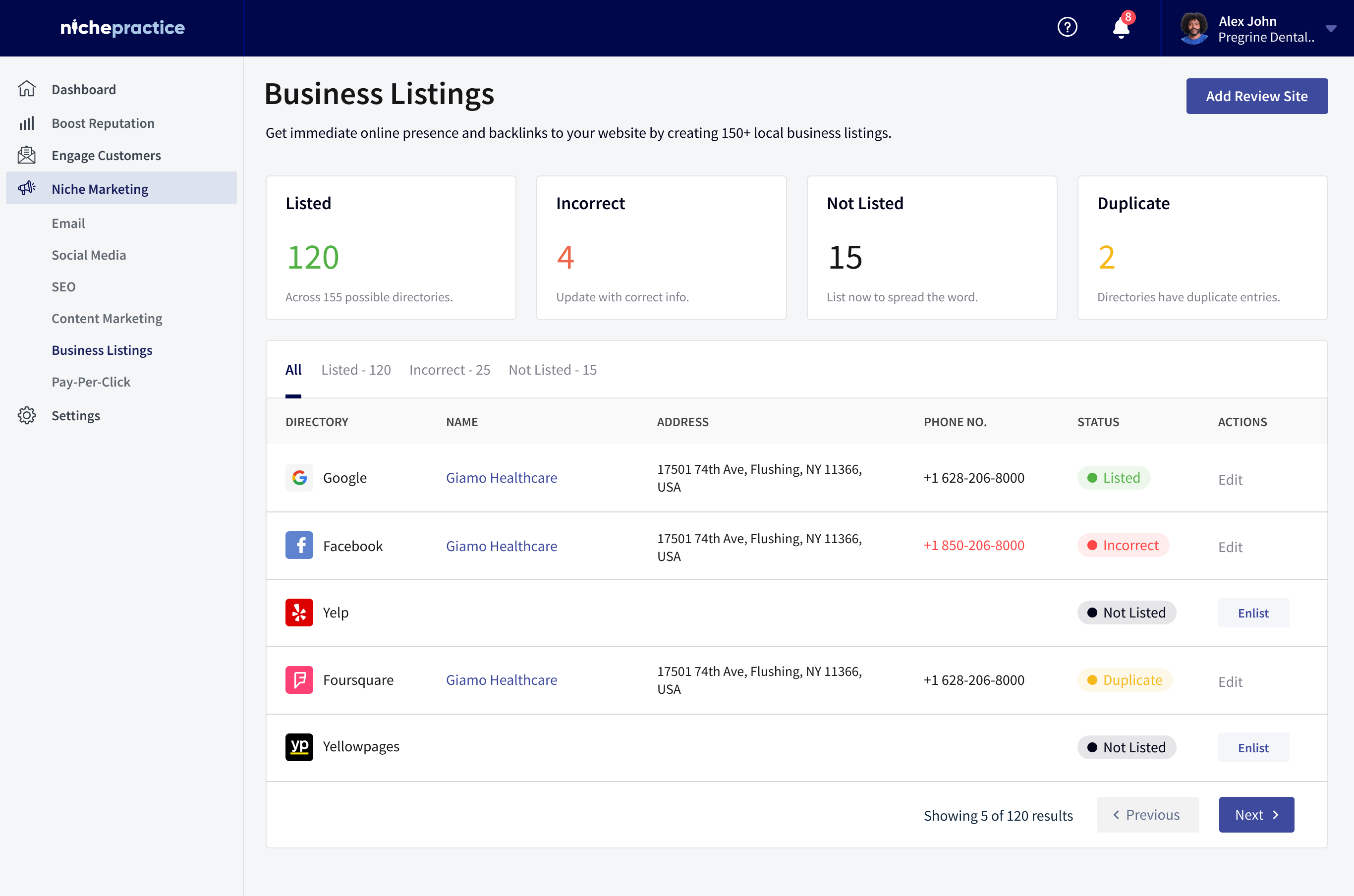
Managing and looking at the reviews and info that one has posted on 150+ possible listing sites is a lot of work. We gathered all of those into one place, where one can see what info is posted and have that information checked against the information the user provided, so any incorrect entries can be spotted. One can list their business on all 150+ listings in an instant by filling out only one form. Easy, no?
Key learnings
- Ask people. It was through user research and internal workshops — equally valuable — that we identified opportunities and ideas that directed us in the right direction.
- Design for all. Look at the age, educational, cultural, and real-world context of users. Design for those scenarios — a practitioner using it after a long day at work. It should be familiar, with no more learning.
- Give the work to algorithms. Building onboarding required a lot of development effort and optimization to gather all that data instantly. Taking that on our end helped users start easily.