The Client
The client was a software product company (NFS Technologies) that offers customized solutions to customers to manage their workplaces and offices using their Workspace Management Engine. They wanted to release a visual revamp and improved UX for their product.
The Problem
The current product was designed and developed solely by the internal team of engineers and PMs. The tech stack and templates were the key driving factors in how the product would look and work. The client wanted a visual and UX revamp for their summer release which they could test out. This release would also get them ahead in the competition, as their old-looking visual design and legacy UX was affecting their sales.
The company has customers like WHO, PwC, Danske Bank, and British Airways, to name a few. It was a big opportunity to work on a product that is being used by big enterprises — companies and organizations which have a big impact on people’s lives.
My Role
My main focus was on UX audit, research, wireframing, setting the visual language, and communicating with the users and the client. I was later joined by another designer to work on the visuals.
Understanding the problem
We began our collaboration with the client by having a call with them and understanding their needs, their users, and the project scope and final deliverables.
At the time of project kick-off, we had a discussion with the client to learn all about their business model and how they sell the product. Later we scheduled another call with them to learn about the users. We learned that most of the users felt the system looked very old and the UI was not modern, and others found the system hard to use due to some complex task flows.
After discussions with the client and our initial discovery, we determined the main areas of improvement and set our goals. We started with Diary, which is the most used and visited feature/tab by users. In this way, we would learn how the users see the new design and what their feelings about it were. This would also help us define the visual language for the redesign.
It was also necessary to identify what changes could potentially cause frustration to old users, and how we could make the maximum number of people accept the new change — as it is always hard for users to accept change, be it UI or UX.
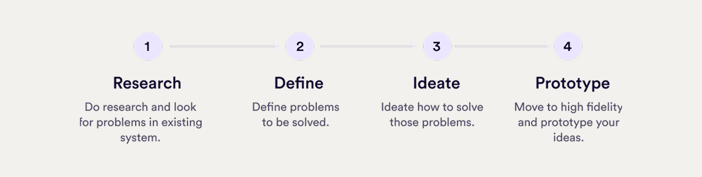
Identifying problems
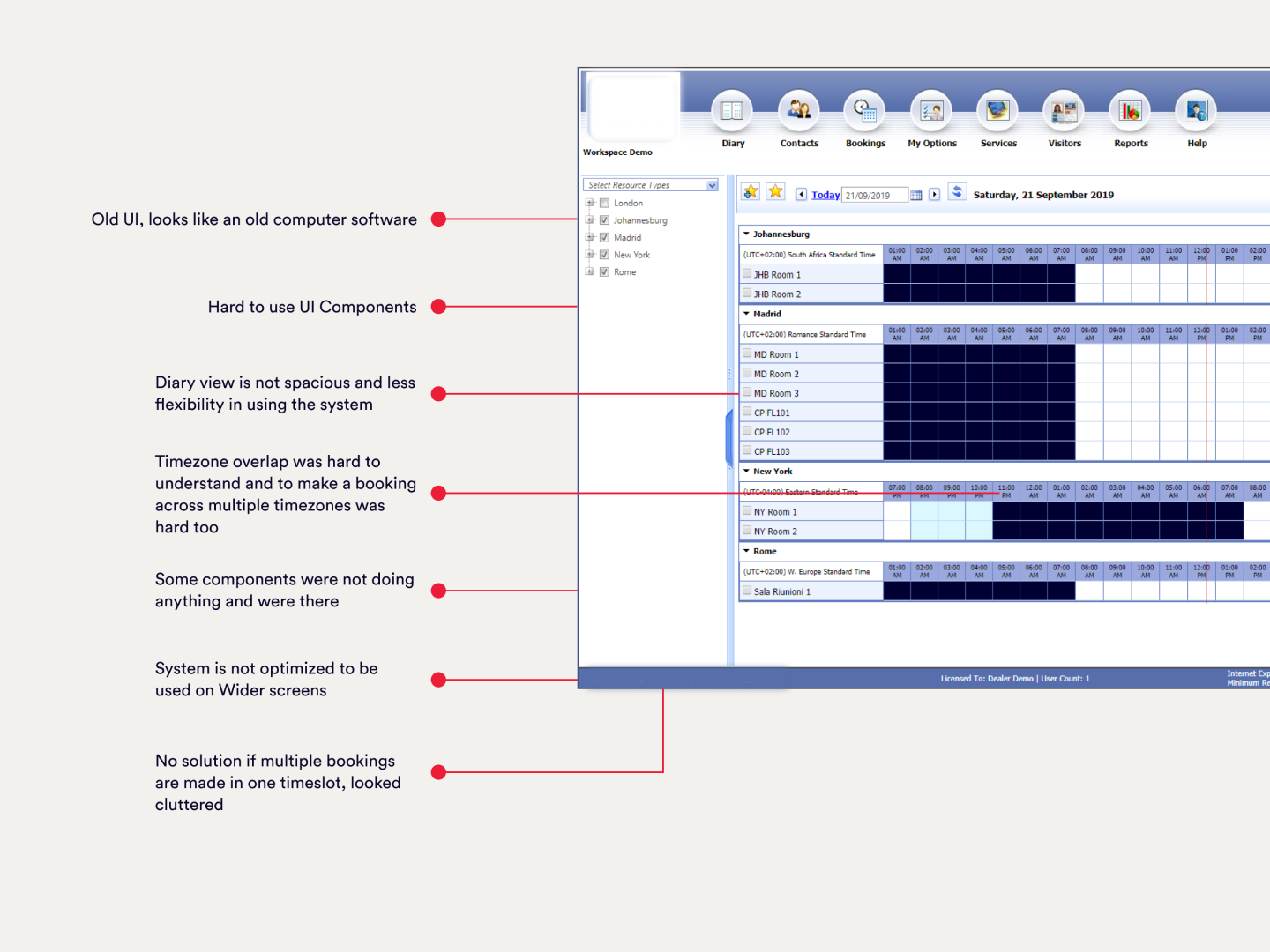
We audited and compiled a report, and kept that as our point to focus on for this project, listing all the problems we would try to solve.
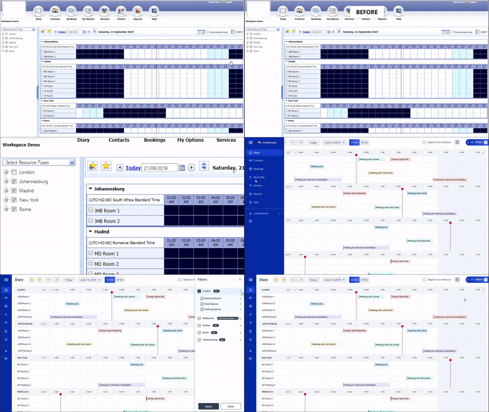
Here are some visual and UX problems we identified in the current platform.
Understanding users
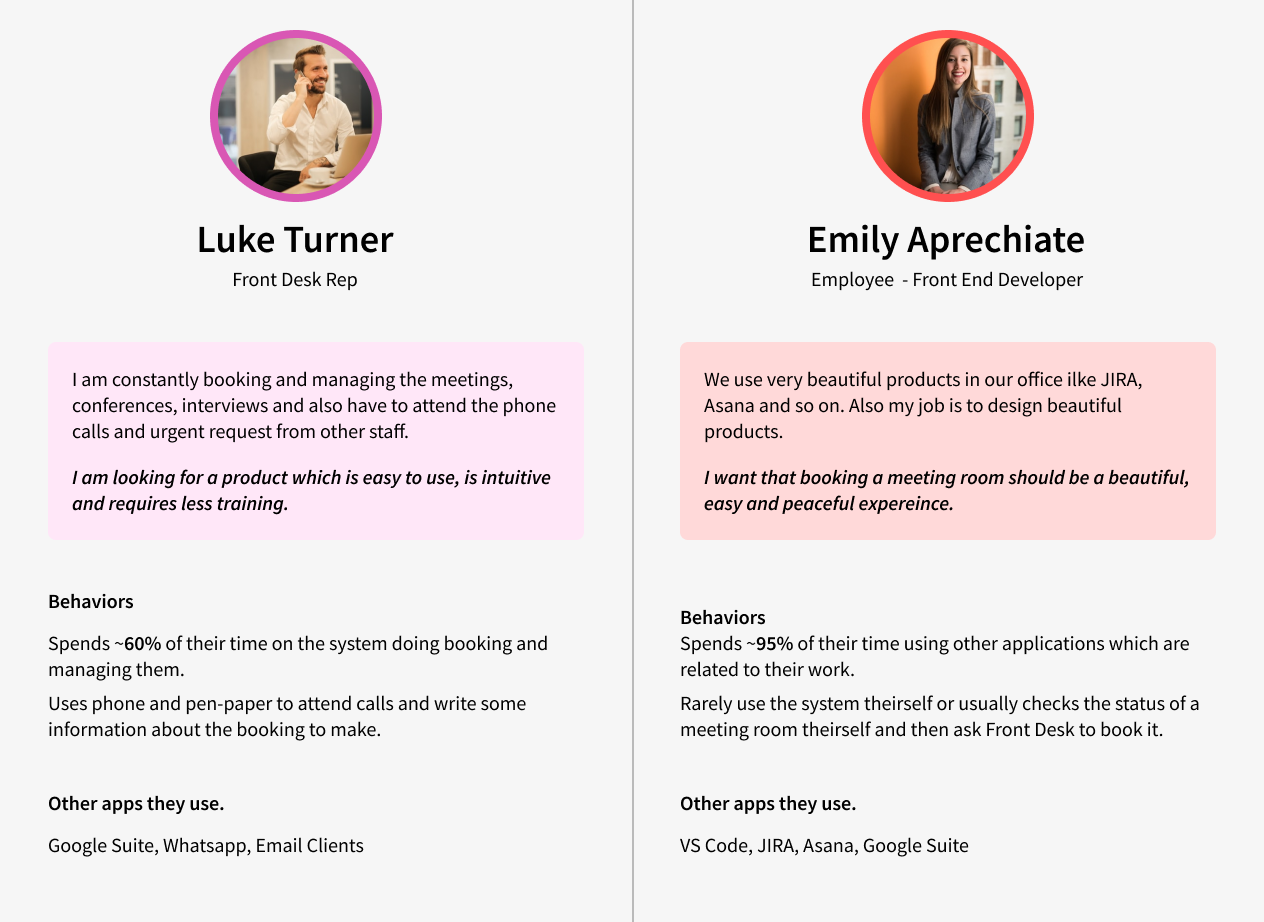
We listed down the different types of users who use the product on a daily basis. We found four main categories of users who interact with the system directly or indirectly. In a typical office scenario, Front Desk Reps, Employees, Office Admins, and maintenance staff were the people we identified as using the product.
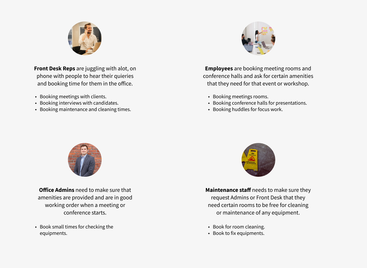
Based on the above information I dug a little deeper into each person’s daily routine and studied, through the research the client already had about them, how their day-to-day goes and how the product fits into their routines and helps them. I then synthesized the data and formed two user personas to keep the users’ motivations and needs in front of me.
Ideating
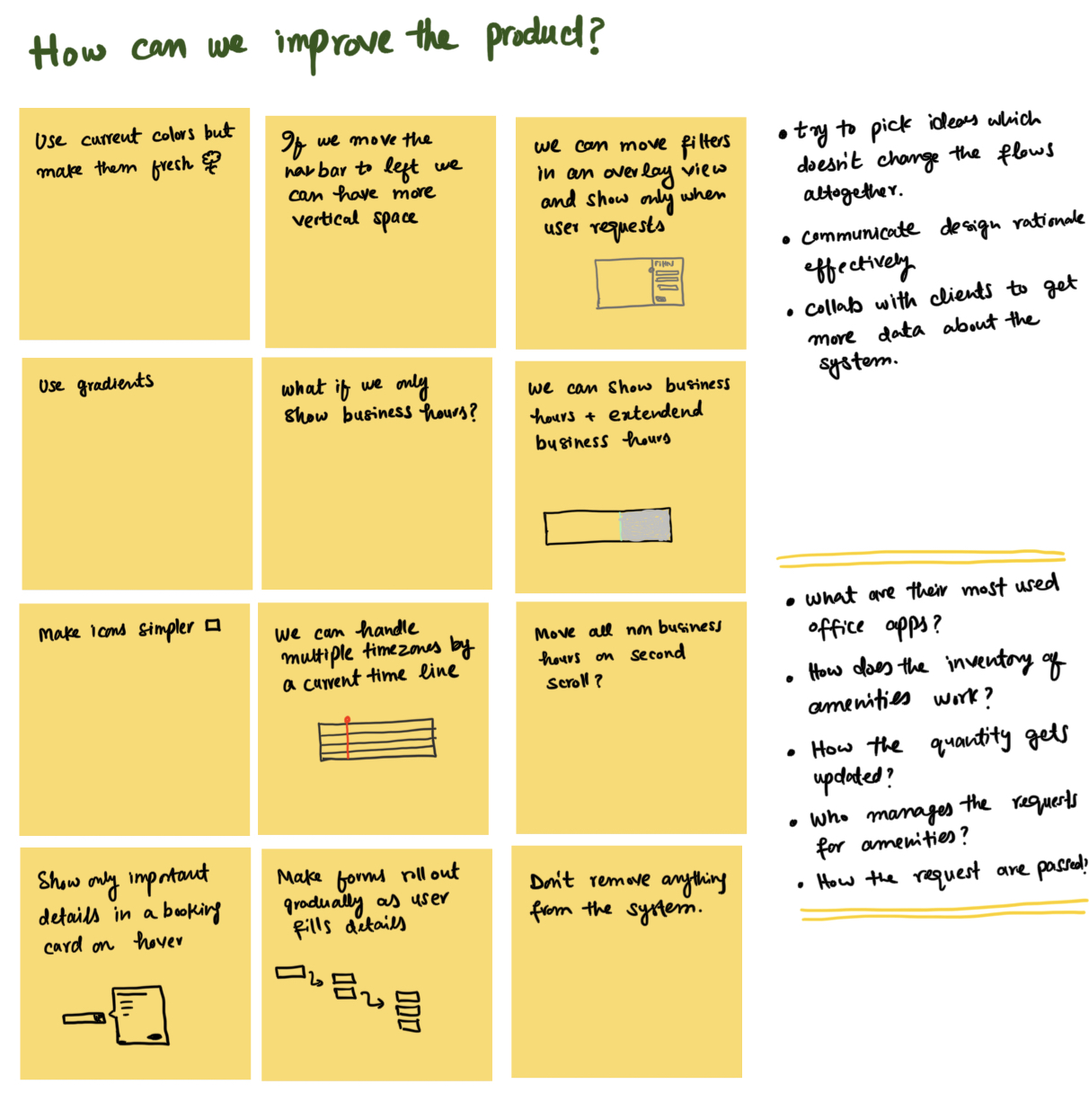
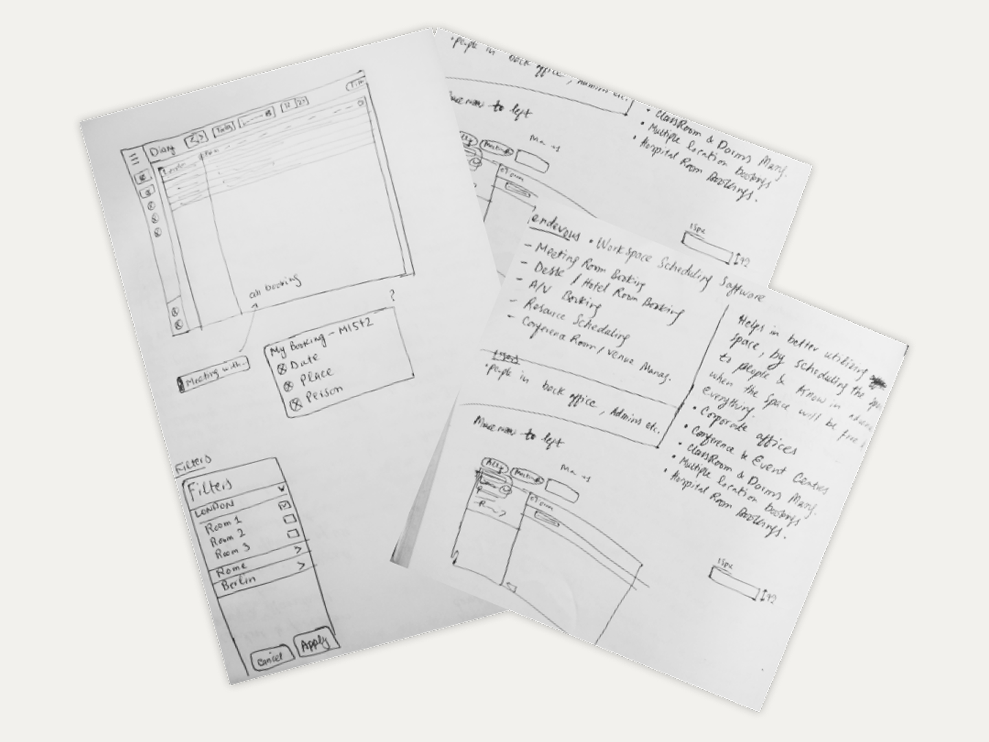
I started ideating and gathering my thoughts on paper. More questions came up when I started working on it. I communicated those with the client proactively, which helped with the right data and direction at the right time.
Explorations & Inspirations
I started looking at direct and indirect competitors of the product. Some of the competitors had very simple products, but some had more complexity. I had to consider that the solutions I work on are not influenced by any of these, but fall under the UX patterns and visual language of the current product, so there is no drastic change for people who are already familiar with the product.
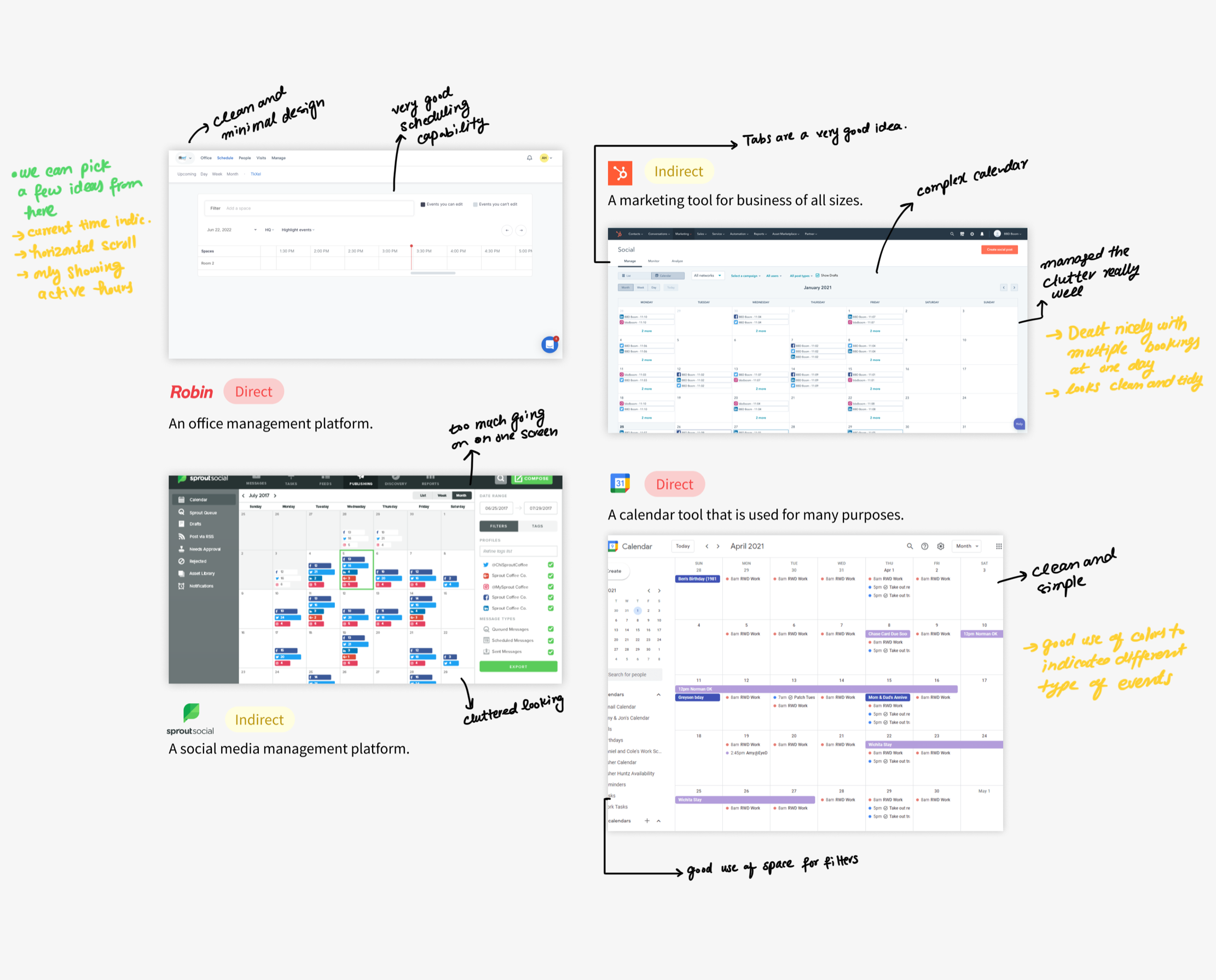
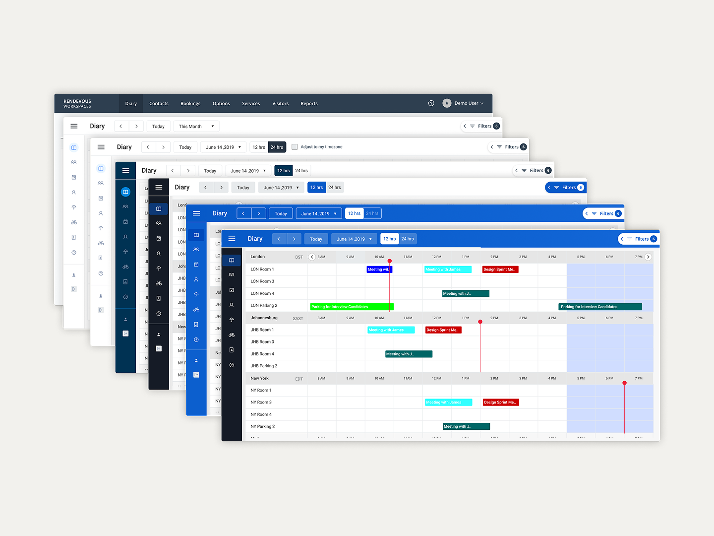
After this research on the competitors and analyzing how I could improve the product, it was time to sit at the desk, open Figma, and start designing. I started with different layouts and explored different directions to solve the problems identified in the research phase.
This phase is always iteration, iteration, iteration — until one lands on a solution that is simple, unique, and useful.
Defining the Visual Design System
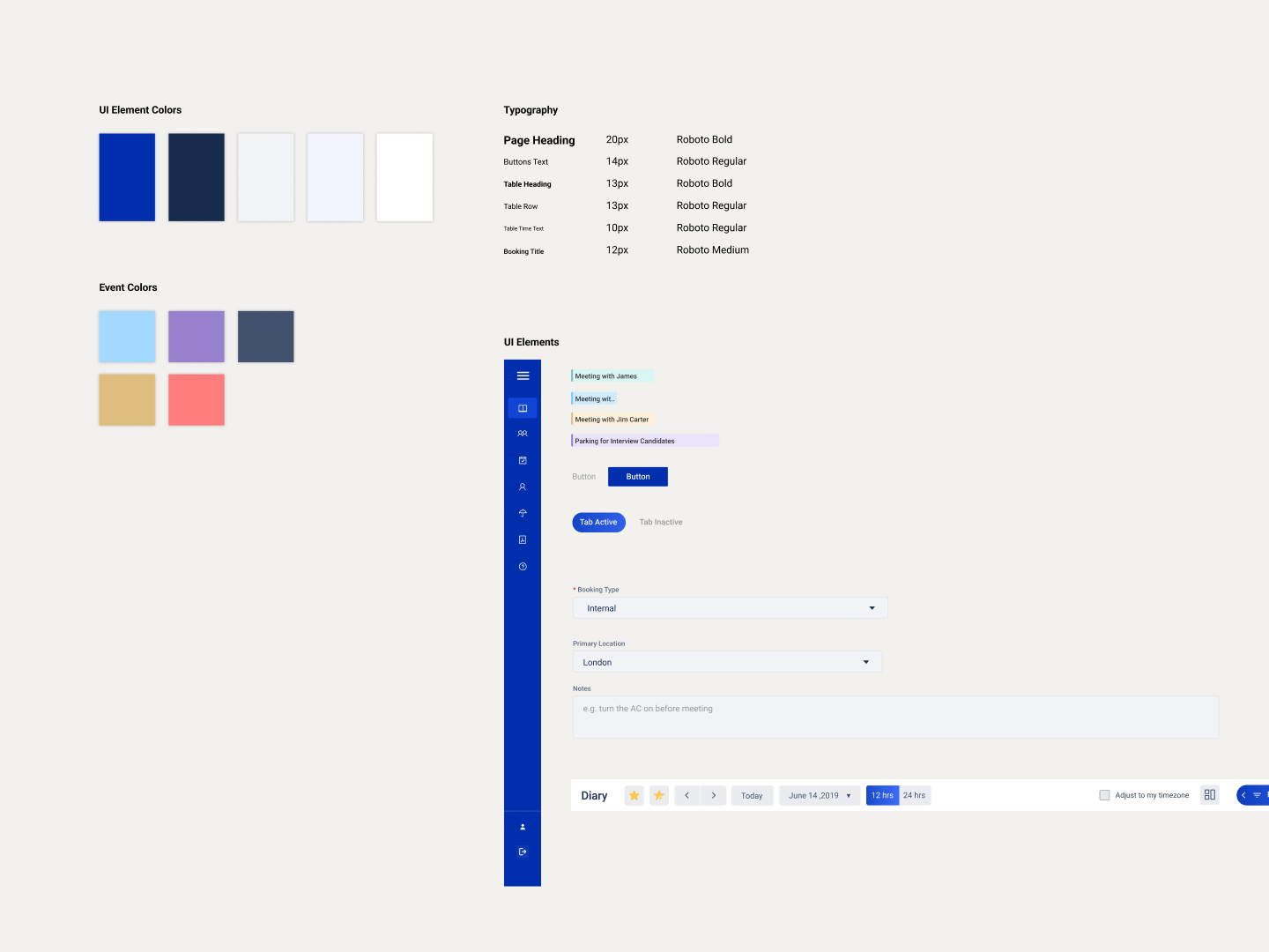
I also had to put everything in order and see how every color, component, and typography fits into a system. This approach helped when later another designer joined me on this project to work on the UI of the flows. I made components for all the assets that we had within this project.
Final Design
Flexible & Simple Filtering
Filters were taking up space on the screen and making the overall interface cluttered. When a user had applied filters, they were still seeing that filter as applied with all its settings in front of them. We found that to be a visual overload.
Solution. We found out during the usage analysis that users don’t have to switch and filter a lot. Front Desk Reps usually apply a filter to reach their certain workspaces and then go with that view for a long time. We also gave them functionality to save the filters for later use.
Managing Different Time Zones
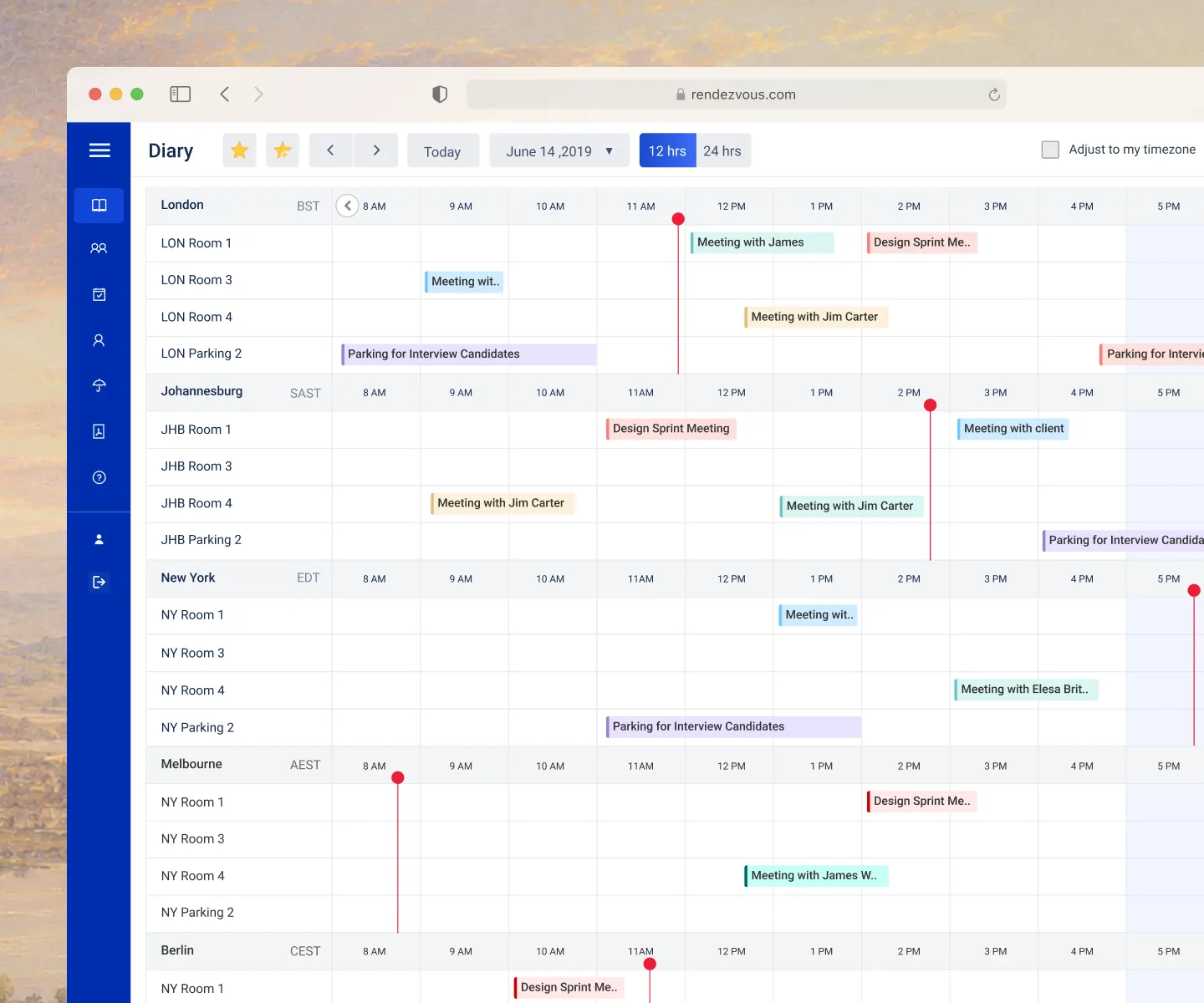
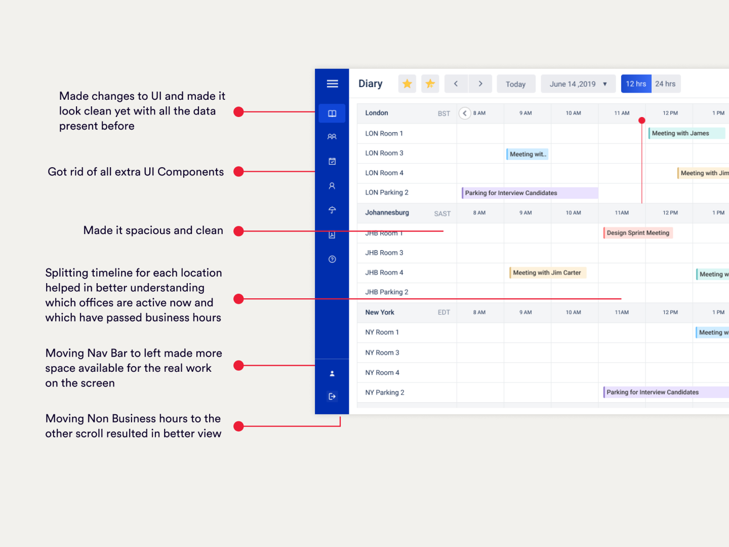
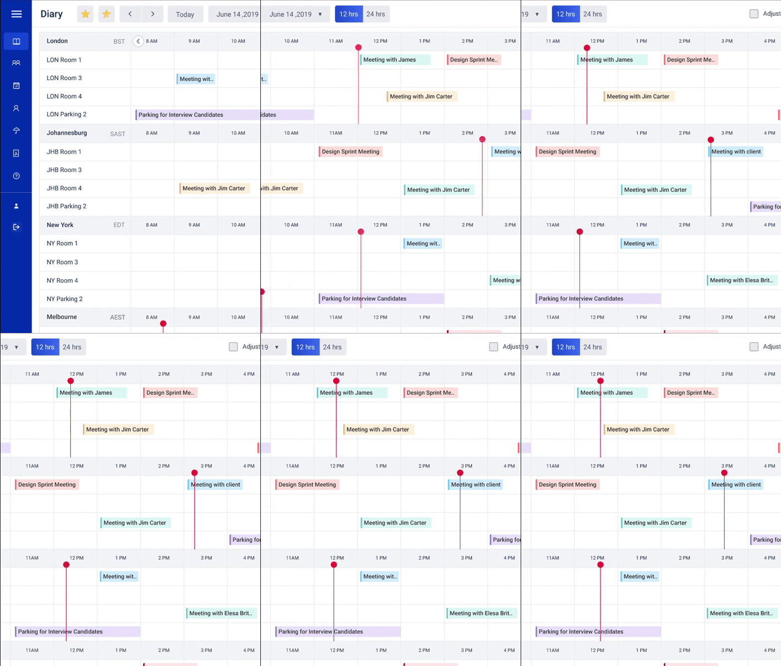
Another key problem was that in the previous system, all the time zones and office locations were adjusted to show all 24 hours in one view, and it was making the interface cluttered. There was a red line to indicate what time it was relative to the current location of the user.
Solution. We moved to a view of 12 hours (business + extended business hours), because our study showed that even when working in different time zones there were very few events that would fall at night (outside business hours), so we put them on the second scroll. We also found that users wanted to see all business hours in one view for different locations to help them make easier decisions even when they are in different time zones. Keeping all of this in front, we introduced split-time red-lines. There is a red line for each location, helping a user in that location know their exact time — and if they need to book for another location, they know what time it currently is there.
Cleaner and Helpful Booking Forms
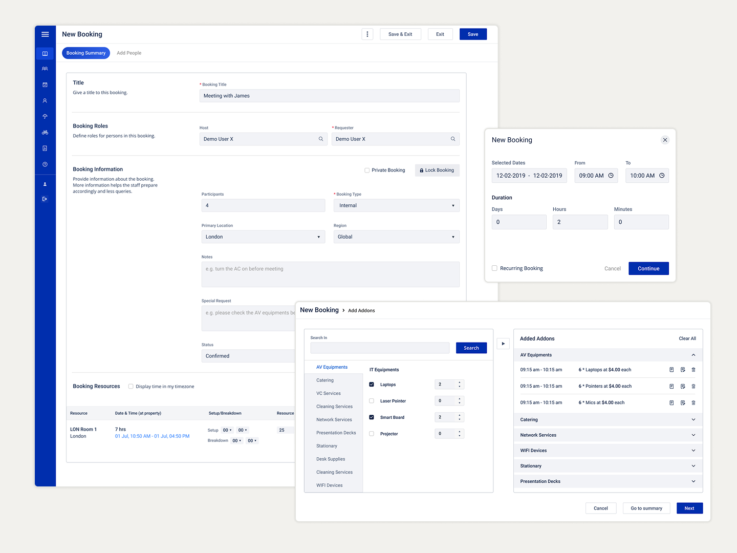
The booking forms were made to be clean, and we added additional contextual information to give the user information about what each section of the form is about. This also resulted in less time for new users to understand the form.
Handling Clutter with Thoughtful Grouping
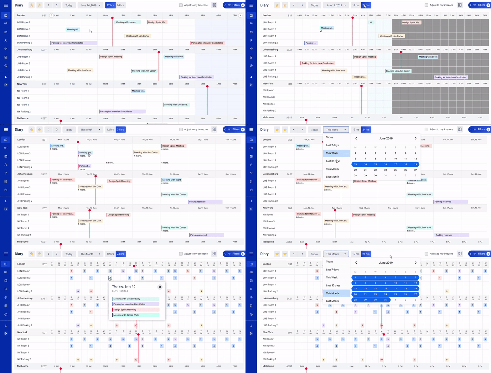
When someone moves to the 24-hour view of the Diary and there are too many bookings at one spot, it gets very cluttered and can result in missed clicks. It was disturbing the workflow of bookers. Many different views like Weekly and Monthly had their own unique requirements.
Solution. We grouped all the bookings at one spot into one card, which shows the number of bookings at that spot on the Diary. As soon as a user hovers, it opens up to show the exact bookings at that spot, which one can open up and see more details about. We removed the clutter with a thoughtful grouping of the data.
Results
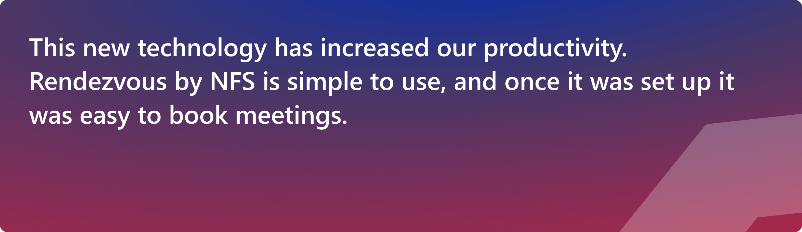
When the redesign was done and tested with a few users, the client’s development team started on it. The new design was well-adopted by the users.

Key Wins
- Better booking experience.
- Clean, minimal, and purposeful UI design.
- Improved visual hierarchy and UI components.
- Easy to be used by existing users.
- Modern and contemporary look & feel.
- Achieved design consistency by making standardized components.