The project
Sendoso is a B2B sending platform. We offer a SaaS platform along with storage, shipping, and integration solutions under one roof, to help businesses fast-track their gifting strategies. Marketing teams use it to increase engagement, conversion, and pipeline. Sales uses it to accelerate the funnel and close deals. CX uses it to improve retention. HR uses it to attract talent and celebrate milestones.
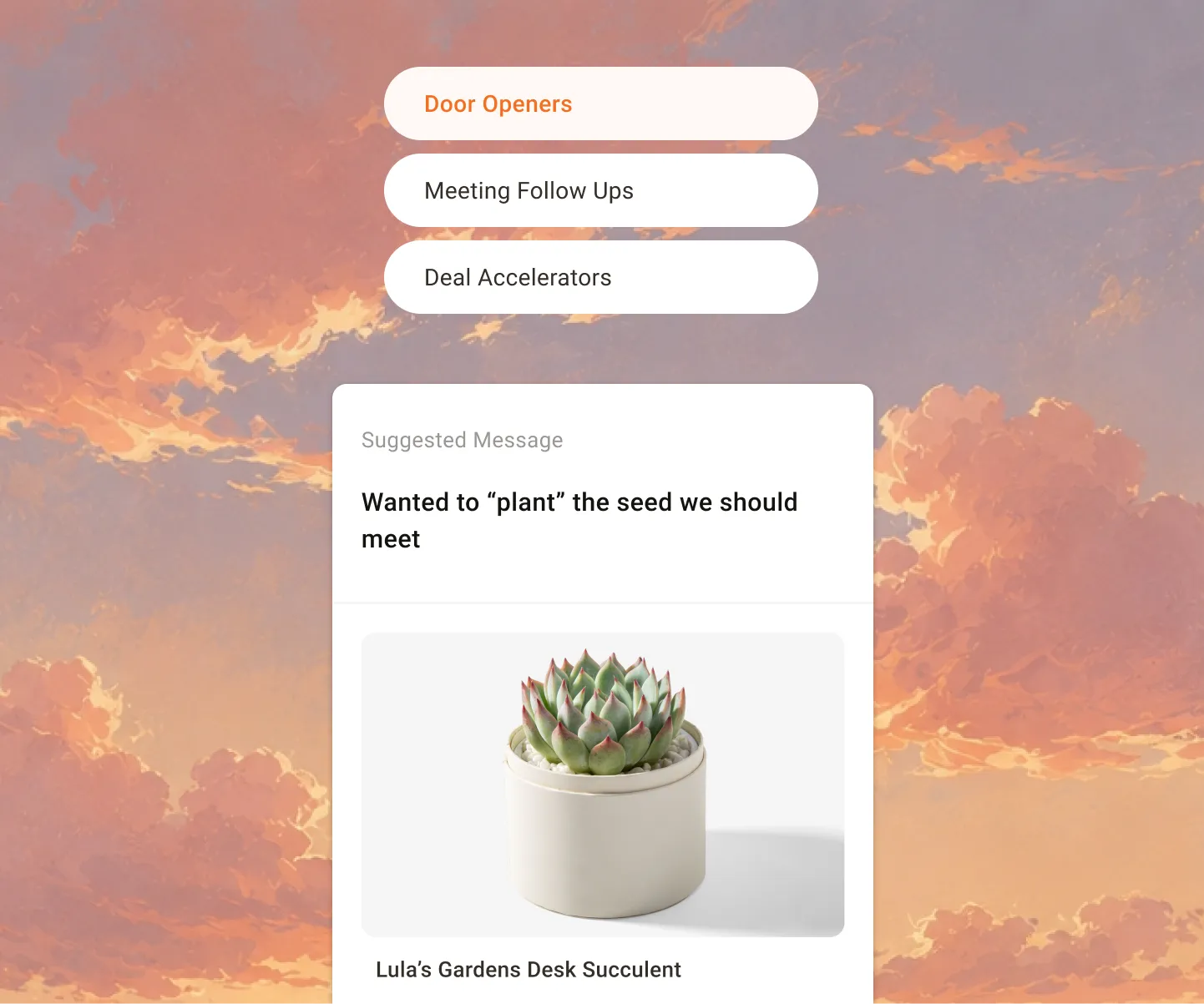
Playbooks are use-case specific gift ideas, each pairing a suggested gift with an associated message. A Starbucks eGift with “Grab a cup of coffee, we have a latte to show you.” A Domino’s play called Pizza Party On Us. A DoorDash card that says “Enjoy lunch on us.” The plays are curated from the Sendoso community’s best practices and the sends that have actually worked, so a sender doesn’t have to invent a gifting strategy from scratch.
My Role
I worked in a cross-functional team of one designer (me), one PM, three engineers, one QA, and one content writer. The company introduced a RASCI matrix the same quarter, so we split responsibilities against it. I was Responsible, the VP of Design was the Approver, PMs were Support, PM plus Research plus Design were Consulted, and engineering was Informed.
That put me on framing the problem, requesting and planning research, wireframing solutions, presenting to stakeholders, hi-fidelity design and prototyping, planning usability testing, handing off to engineers, and design QA.
How it started
Our activation metrics were low. Around ~XX% of users who signed up never sent anything at all. They bought the platform, logged in, and stopped.
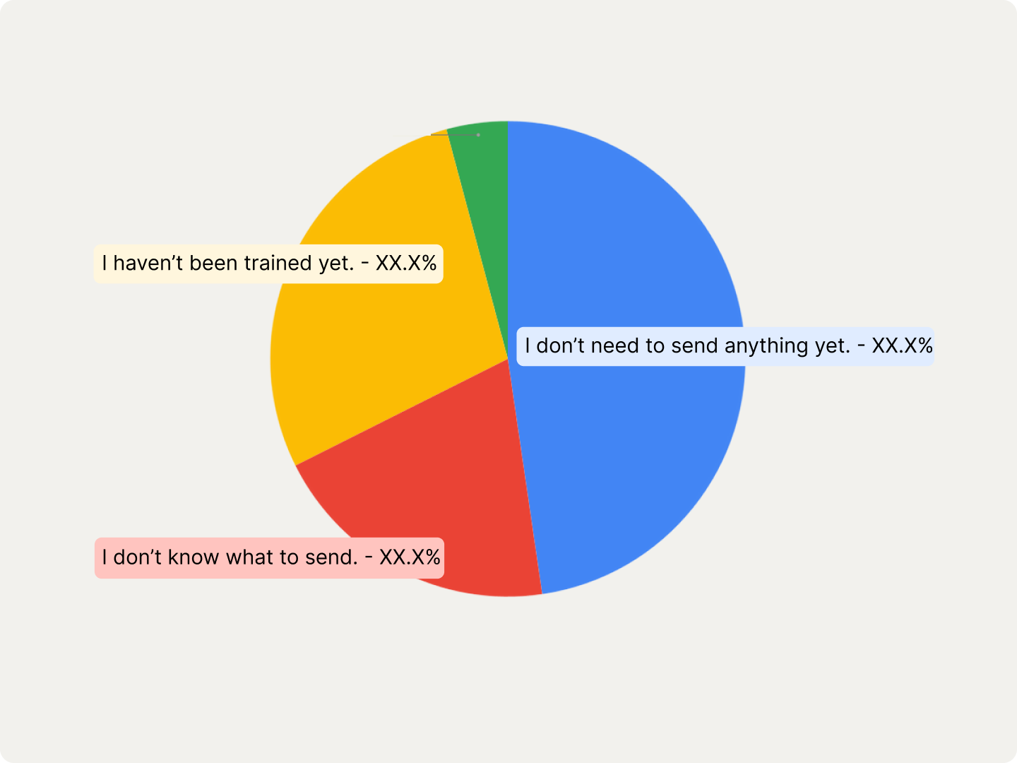
To understand why, we started interviewing managers at those companies to find out what problems they hit while getting started. The reasons weren’t what you’d assume:
- I don’t need to send anything yet. XX%
- I haven’t been trained yet. XX%
- I don’t know what to send. XX%
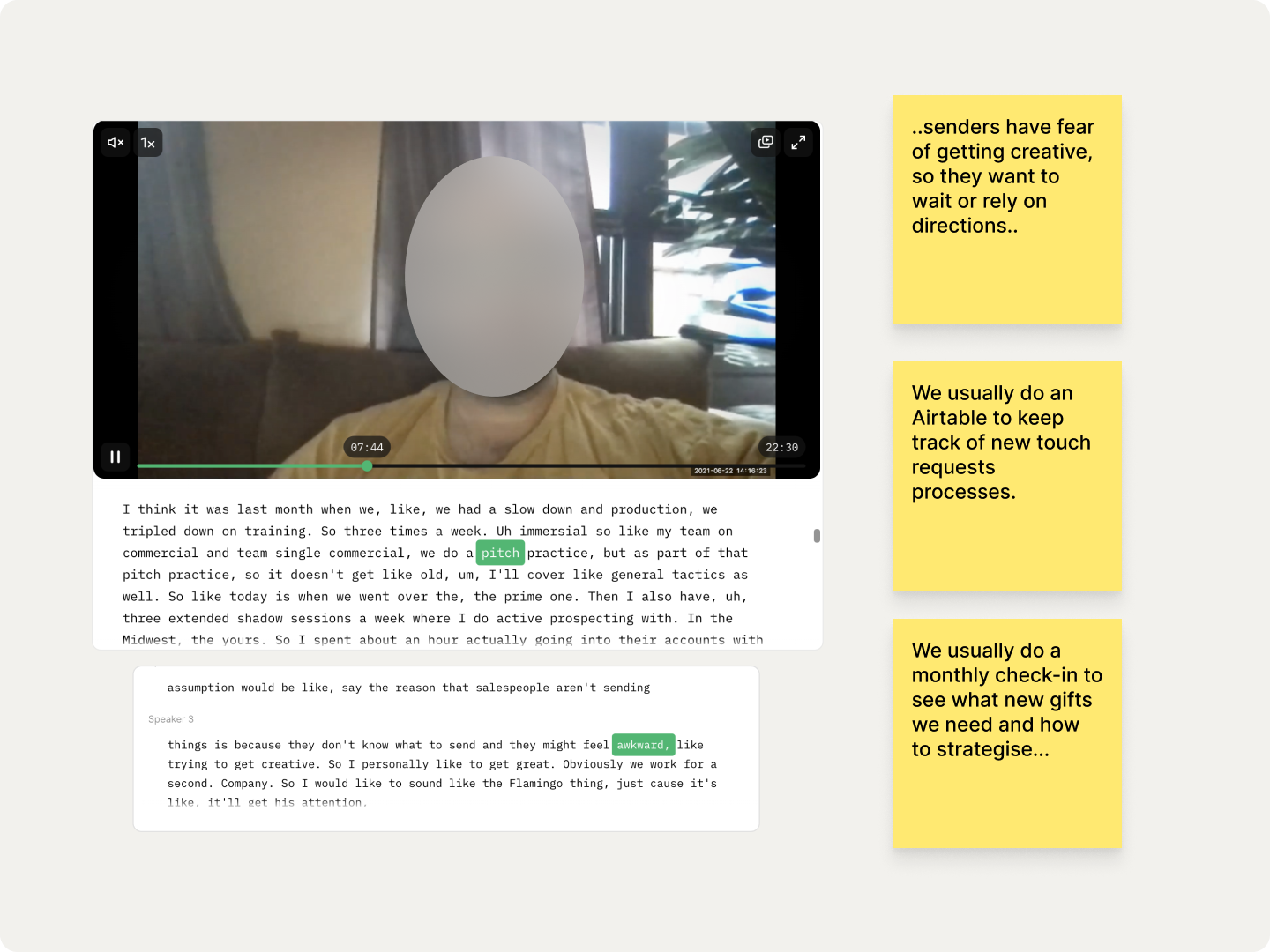
The interviews gave us the texture behind those numbers. Senders weren’t lazy, they were hesitant.
Senders have fear of getting creative, so they want to wait or rely on directions.
And everywhere we looked, people had already built their own workaround. Managers ran monthly check-ins to decide what new gifts were needed. Teams kept an Airtable to track new touch requests. Senders Slacked their managers with the details of the touch they wanted. One company handed new senders a slide deck telling them what to send at each stage. Another sender told us:
When I started I had been given a walkthrough of what to send, but there is no document to see that again.
Every customer had invented a playbook. None of them had one inside the product.
Why they were needed
There were two folds to this problem, one the user problem and one the business problem.
User problem. Our sales users don’t know the best course of action to take when they first sign into Sendoso. Typically they aren’t familiar with a sending or gifting strategy at all. Our solution should give them a way to browse gift options for their specific needs, so they can start sending and get value out of the platform.
Business problem. Only ~XX% of users who sign up get to their first send. But our data showed that ~XX% of users who make that first send go on to send again. The first send was the hinge the entire account swung on, and half our users never reached it.
Define the problem
The next step was placing the problem in its real context, defining an optimal user experience while actually solving the business problem.
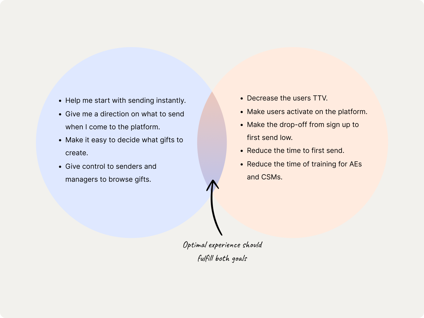
User goals. Help me start sending instantly. Give me a direction on what to send when I come to the platform. Make it easy to decide what gifts to create. Give senders and managers control to browse gifts.
Business goals. Decrease time to value. Get users activated on the platform. Lower the drop-off from sign-up to first send. Reduce time to first send. Reduce the training time for AEs and CSMs.
The optimal experience had to fulfil both. Playbooks sit in the overlap.
Problem defined
After internal discussion, and framing the problem from both the user and business perspective, we could write it down:
We are seeking to solve the problem of users activating on Sendoso by making it easier for them to identify what to send and when to send what, via our preset playbooks.
Ideating solutions
My partner PM, myself, and other stakeholders ran a workshop to define the scope for V1. We came out with two paths to explore:
- How plays would work during onboarding?
- How plays would work as a standalone feature?
Exploring playbooks in onboarding
I started wireframing ideas for introducing plays inside the sender’s onboarding journey. Get them to a first send in the same session they sign up.
It hit dead-ends, and they were the kind you can’t design around:
- What if no balance is available to the sender on sign-up?
- The manager can’t assign balance until the user is created.
- There’s no system to request balance from a manager.
- What if the sender has no gifts assigned to them?
Internal testing closed it out. This onboarding was too much to take in for a first-time experience. We were trying to solve activation by making the first five minutes heavier, which is the opposite of the point.
So we dropped it. Discarding ideas is better than shipping something not usable.
Exploring playbooks standalone
Back to it. I was thinking about how we could still personalise the experience and help a sender find only the plays that were relevant to them, instead of handing them a list.
Three ideas came out of it:
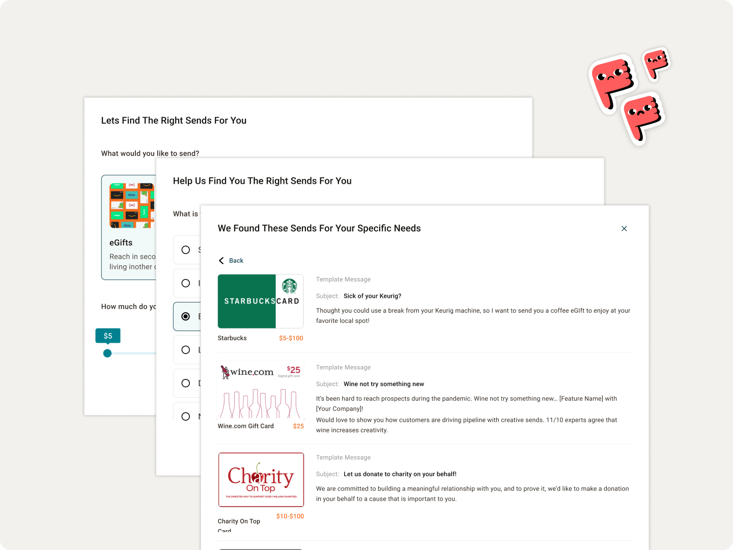
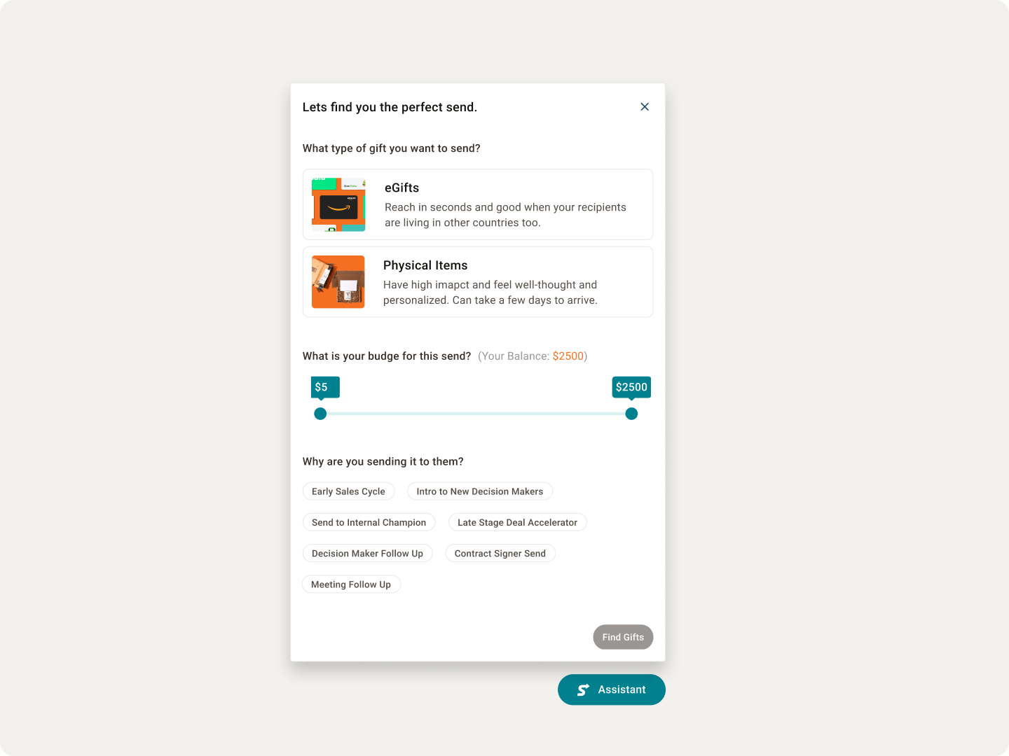
Sending Assistant
Guide the sender through, showing only plays related to them and surfacing suggested sends out of the list.
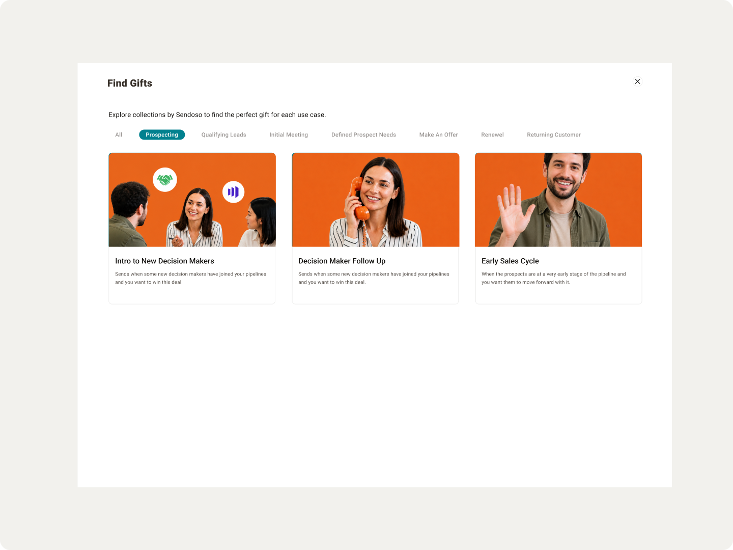
Browsable Collections
Group plays into collections, divided by stage of cycle and by the user's department.
Filters Modal
Let the sender filter their own way to the right use case.
Reaching final design
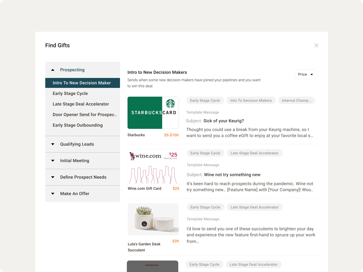
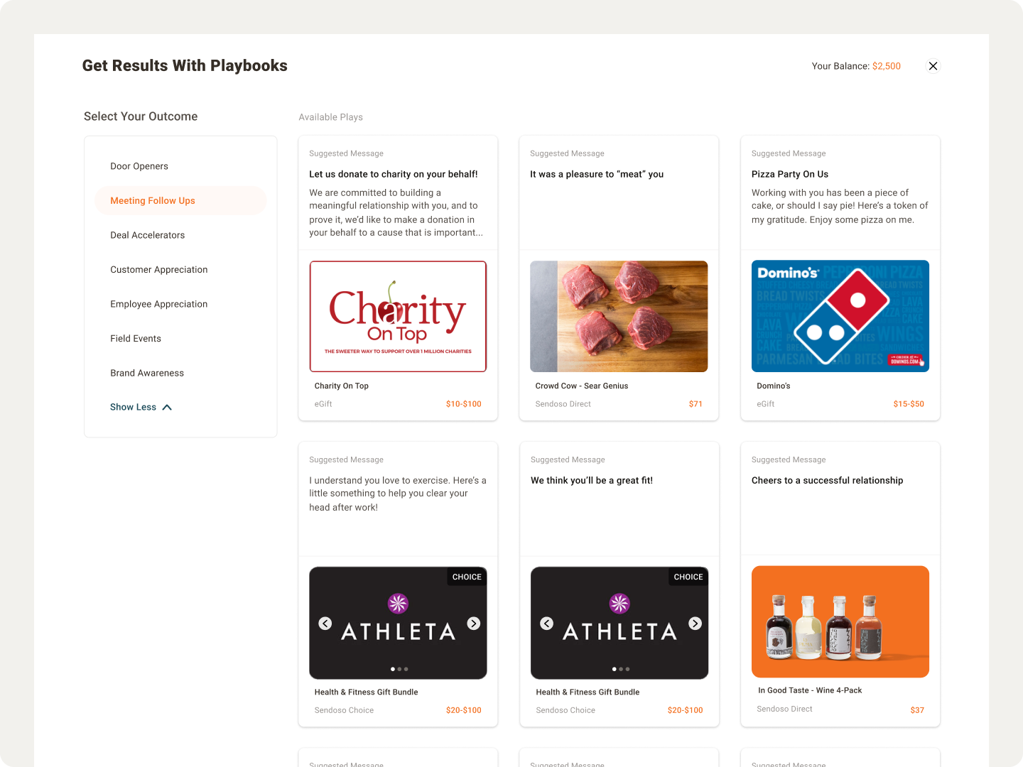
The explorations converged on a full-screen experience with filters. That left three things to finalise: the use case picker, the play card, and the entry point.
Cleaning up with more exploration
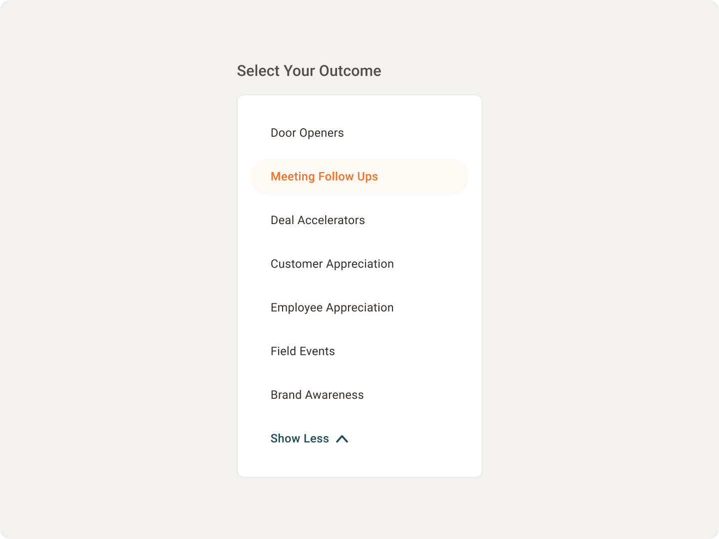
The exploration and feedback gave us confidence that a sidebar was the right approach for filtering between use cases. The next question was whether we needed to explain what each use case meant. I made a few variations for showing a use case description without cluttering the interface.
I passed them to my PM, who set up testing sessions with users. We learned that sales users and senders already know these terms and don’t need any of them explained. That let us simplify the component down to a much quieter final version.
Fixing the play card
I started with a hypothesis: adding stats and metrics to a play would give senders more confidence to send it. Proof that the play works.
We couldn’t do it. We’d never measured play success that way, so we couldn’t show stats across all plays, and a card that only sometimes carries proof is worse than one that never does. The idea had to be dropped.
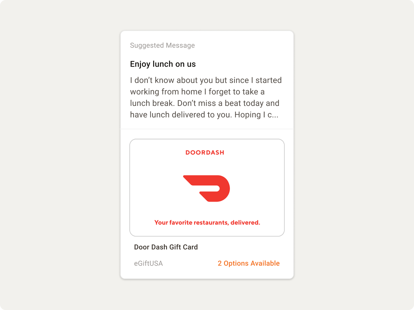
What was left was making the card clean, standing out, attention-catching, and trustworthy on its own. I iterated through variations and presented them to the design team and other PMs, and we landed on the one that held up across every scenario the card had to carry:
- Displaying the gift name instead of the touch name.
- Multiple options to choose from.
- An action button to request a play.
- Expanding the card to show a truncated message.
Where to place Playbooks
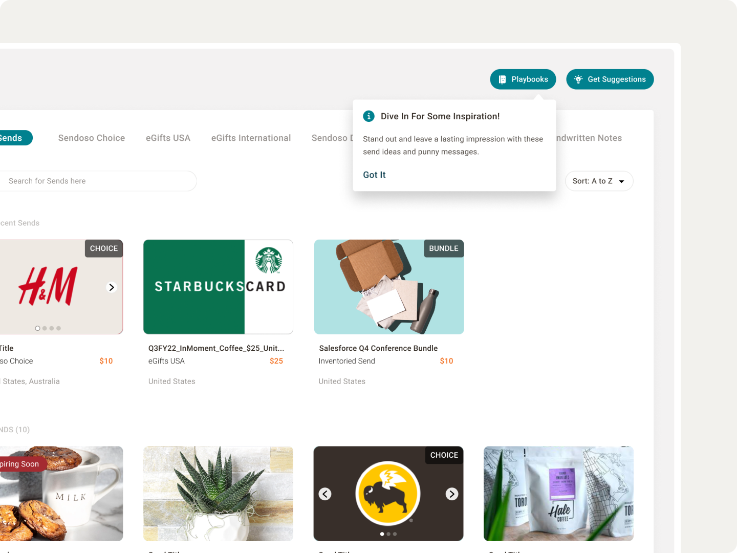
Next I ideated where Playbooks should live and what the entry point should be. We ran testing on this too, with four options.
Users ranked each one. Merging Playbooks in with all other sends came out top, but it also required merging “Suggestions” onto the same page, which is not easy.
So we went with a risk-free approach: place it at the top, ship it, and revisit the position once we could see whether it needed moving.
Notifications, through email
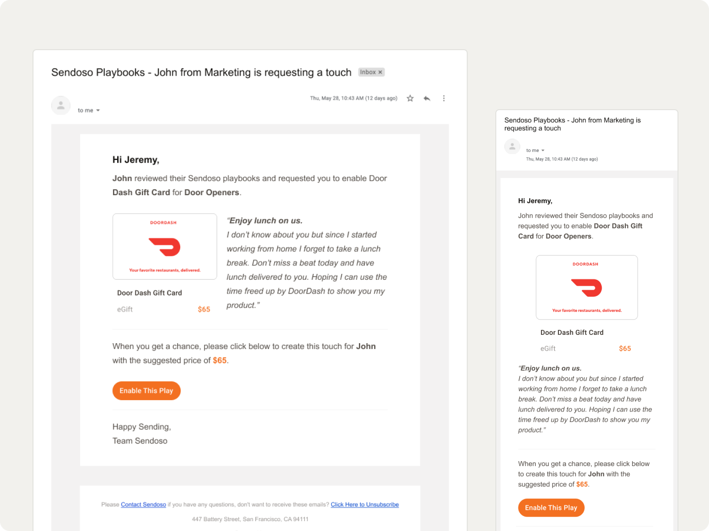
Senders can request a play from a manager when they spot one they like that hasn’t been created yet. I wanted to handle that in the platform, but notifications belonged to another team and I had no control over their timeline to build a notification centre first.
So I designed emails. The manager is notified when a sender requests a play, and the sender is notified when the manager creates it. Not the version I wanted, but it closed the loop.
Putting everything together
An experience is not its individual components. How they come together into a holistic, usable product is the actual function of the job.
I had multiple sessions with the VP of Design to get the designs approved. Once the layouts, interactions, copy iterations, and edge cases were handled, my PM and I presented Playbooks at our Quarterly Exec Review. It got a lot of appreciation from the executives, and soon after we passed it to engineering for development.
Handing off and QA
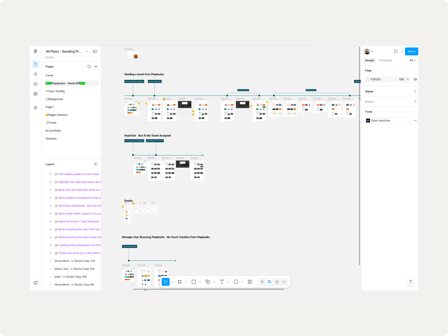
Some of the engineering team had been consulted throughout the project and had already started parallel work on a few flows. For the formal handoff, I built out the journey with notes for them, got all the engineers on a call, and walked them through it.
Design QA was mine as well. I reviewed the built feature and flagged discrepancies back to engineering. And before any launch we roll the feature out to a group of customers for beta testing, to catch UX issues and edge cases we might have missed.
The launch
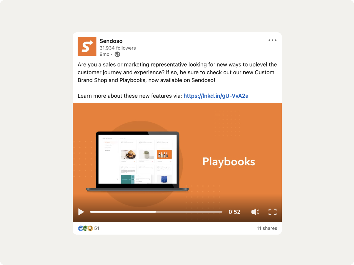
Playbooks launched in our October release. We saw good traction almost immediately, from existing customers and new ones, and praise came in over email and social media.
I am really excited about the launch of Playbooks and to leverage the best practices, strategies, and tactics that have proven successful.
SurePoint, Chief Marketing Officer
Playbooks is a game-changer, we can’t wait to see more sending ideas being added.
TigerGraph, Marketing Programs Specialist
The impact
We measured Playbooks against several metrics across the product, and found it to be a working solution for some of the activation and engagement problems we set out to fix.
- XX% send conversion rate
- XX unique touches assigned to senders
- XX% of senders requested plays from managers
- XX unique senders month over month, an increase after Playbooks
- XX% sign-up to first send drop-off
It changed the roadmap
Playbooks was the first step in Sendoso getting the confidence that pre-created gifts could work on the Enterprise platform too. Six months later it kicked off the redesign of Touches, the core of the platform, built on the learnings and the confidence Playbooks gave us.
V2 and beyond
With the success measured, we started looking at future versions, driven by what users told us was missing:
- Give managers the ability to create plays.
- Let managers grant access to team-specific playbooks.
- Automate use case picking based on the gift.
- Automate balance assignment for senders.
- Let senders create plays and route them for approval.
- Let users customise existing plays.
- Take Playbooks into the Chrome app.
Learnings
- Kill the idea, not the deadline. The onboarding direction and the play card stats were both good ideas that didn’t survive contact with reality. Discarding an idea is better than shipping something not usable.
- Another team’s constraint is still your problem. I couldn’t get a notification centre built, so I designed emails instead. The user doesn’t care whose roadmap it was on.
- Ship the safe version and let usage argue. The top-ranked entry point was the hardest to build. We placed it somewhere risk-free, launched, and kept the option open to move it once we had real data.
- Activation is a design problem, not an onboarding problem. Half our users never sent anything, and the fix wasn’t a better product tour. It was answering the question they were actually stuck on: what do I send?