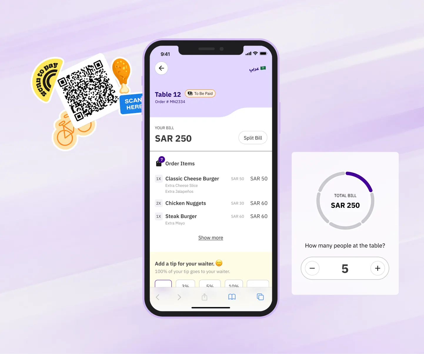
The project
We’ve all been there — waiting around after a meal, trying to catch the waiter’s attention for the bill, doing that slightly awkward hand-wave. It’s a mood killer after an otherwise good evening. So why not fix the problem altogether?
Pay at Table lets restaurant visitors view and pay their bill right from their table, without flagging anyone down. Each Foodics product is a step toward digitizing the customer’s experience, and our decisions are grounded in the needs of our clients and their customers.
Every project starts somewhere, and ours started with a Google Sheet — gathering every requirement a Pay at Table experience had to fulfil. We looked at competitors in the space (Sunday, Qlub, and Spades among others) to understand how the market works, which user needs were already met, and where the gaps were.
Designing the flow
Before making a single pixel work, we gathered the user needs we were solving for and mapped a full end-to-end user flow covering every interaction someone would have with the solution.
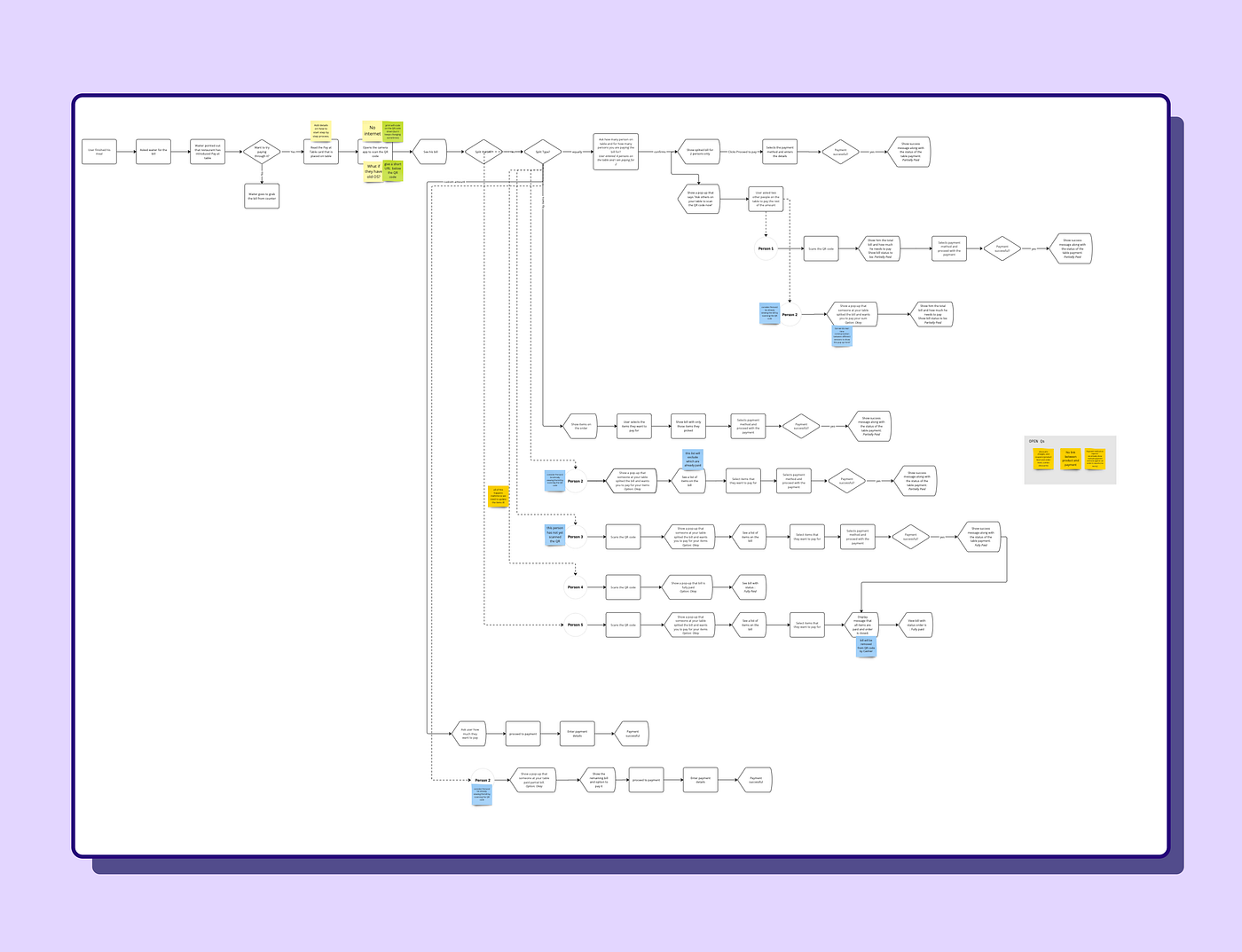
This surfaced a lot of areas that needed further exploration. We caught the dead-ends and error states early.
Making the end-to-end flow also opened up the conversation on how we’d solve this with the cross-functional teams of PMs and engineers.
Once we’d talked it through with those teams, we were confident to move forward — the bottlenecks and error cases were resolved up front. Those conversations also settled technical feasibility and let the engineers start on the architecture.
Understanding the browsers
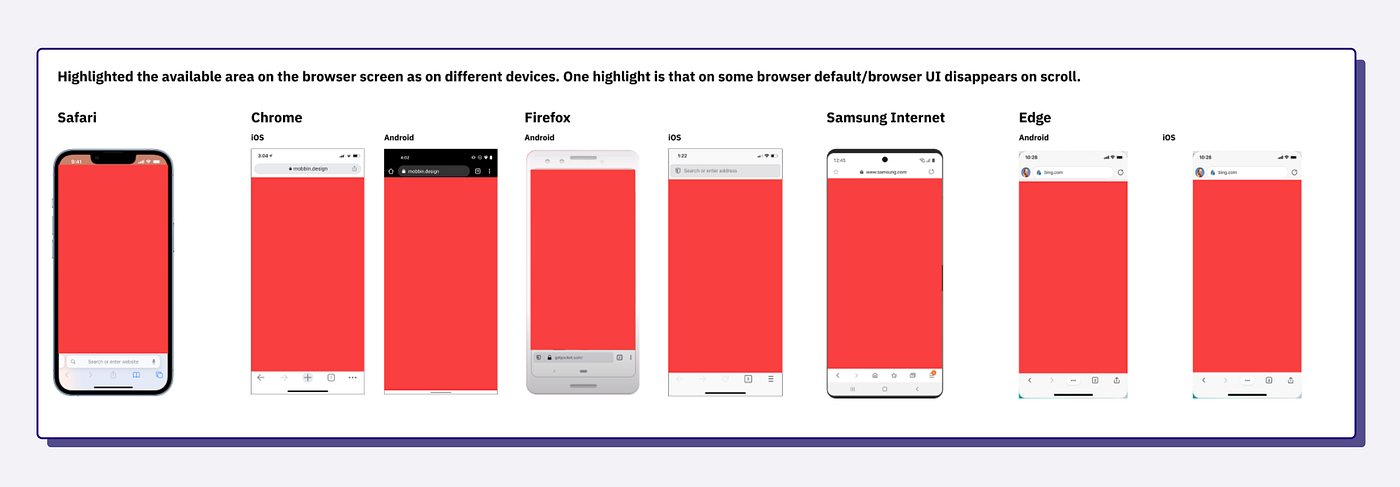
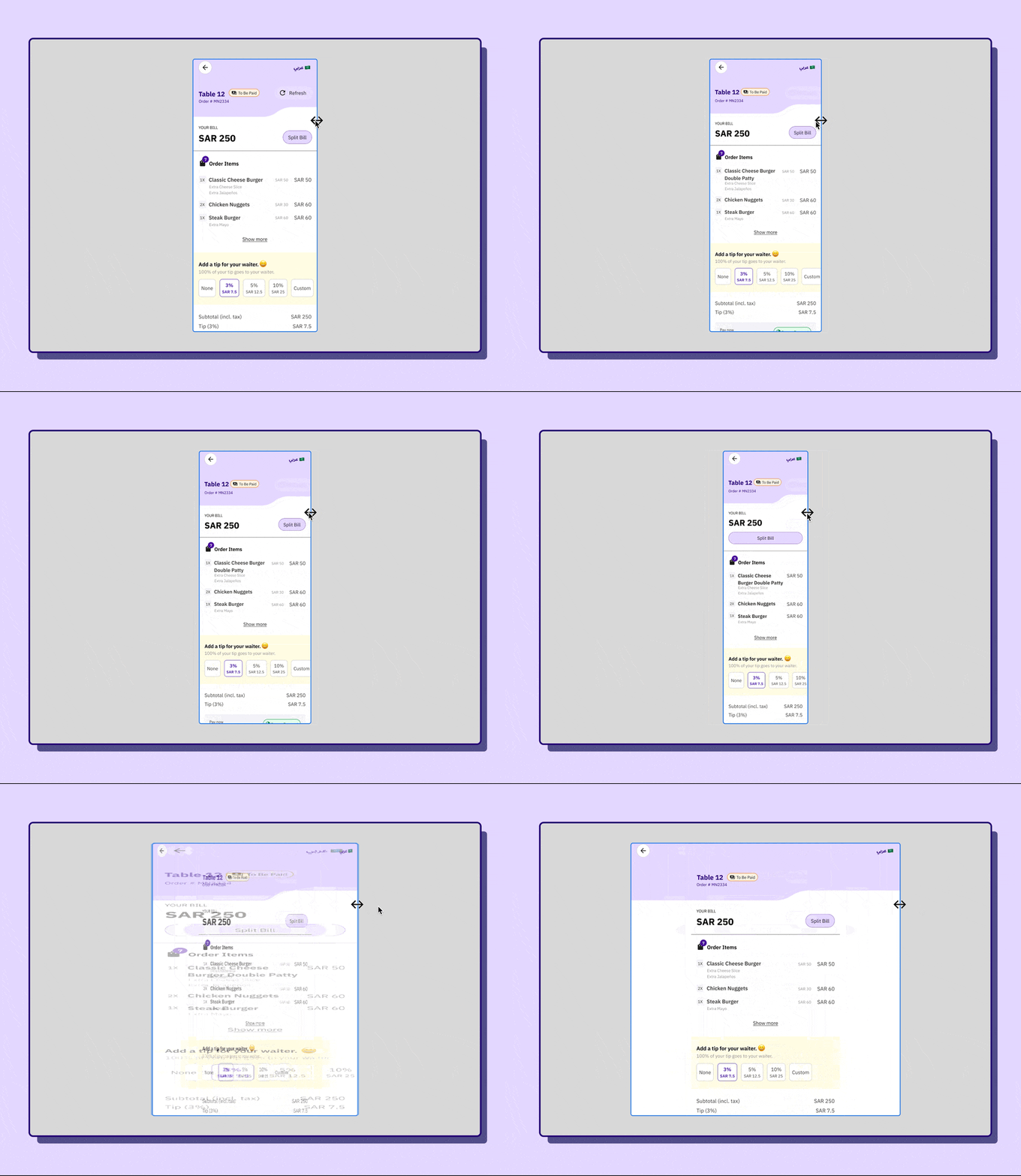
Pay at Table isn’t an app you install. It’s a web app you reach only by scanning the QR code on the restaurant table — which made browsers an unusually interesting constraint. Every browser gives content a different amount of room, and we needed our layouts and content to hold up across all of them.
We looked at browser usage in our markets and studied the mobile browsers themselves. Chrome is the most used in the region, followed by Safari, and Android holds roughly 60% of the market. We also mapped the most common screen sizes, so the foundation we set would work across as many devices as possible.
Wireframes to visual design
With the flow settled and the interactions understood, it was time to map it to screens. We wireframed quickly to see the layout take shape — enough to turn the ideas into something tangible and decide what goes where.
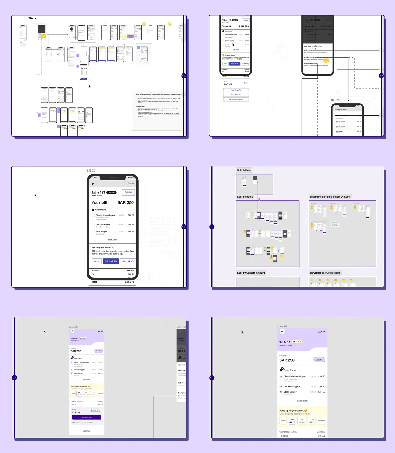
The visual design moved fast thanks to our design system. Leaning on the multi-device framework we’d already set up meant we could pull components straight from it and spend our time solving problems, rather than fine-tuning that one button.
Usability testing
At Foodics we test often, to catch problems early. This product has an unusual quality: it can be used by one person or by several at once, and a bill can be split three different ways. We needed to know whether the designs, the copy, and everything else actually made sense across those tasks.
So we ran remote usability testing — with a twist. To replicate people genuinely splitting a bill together, we tested in groups, recruiting from different departments across the company. We watched how real-time updates kept everyone current as amounts and splits changed around the table.
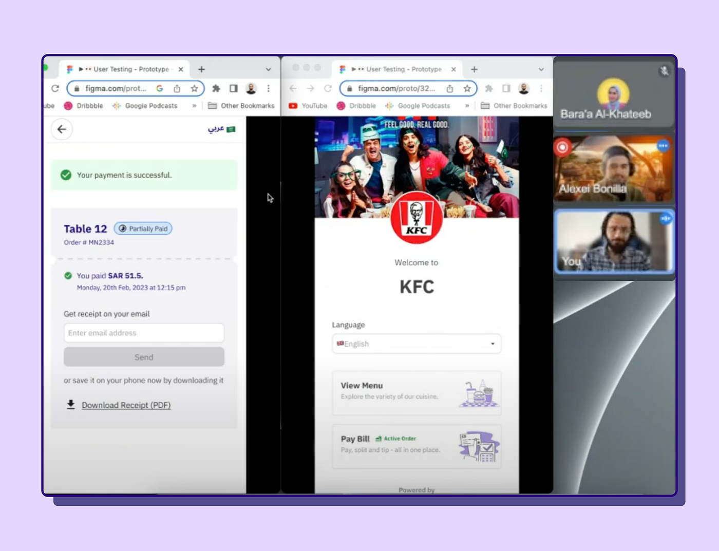
We document everything in Notion. Straight after the study we wrote up the sessions and the improvements we’d found: we redesigned a few screens, rewrote copy in several places, and added affordances where people needed them.
A sneak peek
A few details from around the solution — because we’d love you to notice them.
Little joys
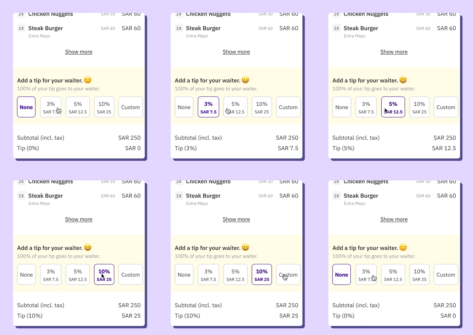
Software should be fun, so we animated the tipping emoji to react as you change the amount: the higher the tip, the happier the waiter looks. Increasing tips isn’t a goal of ours, but if a small detail nudges positive behaviour, we think it’s worth having.
Stay in sync with others
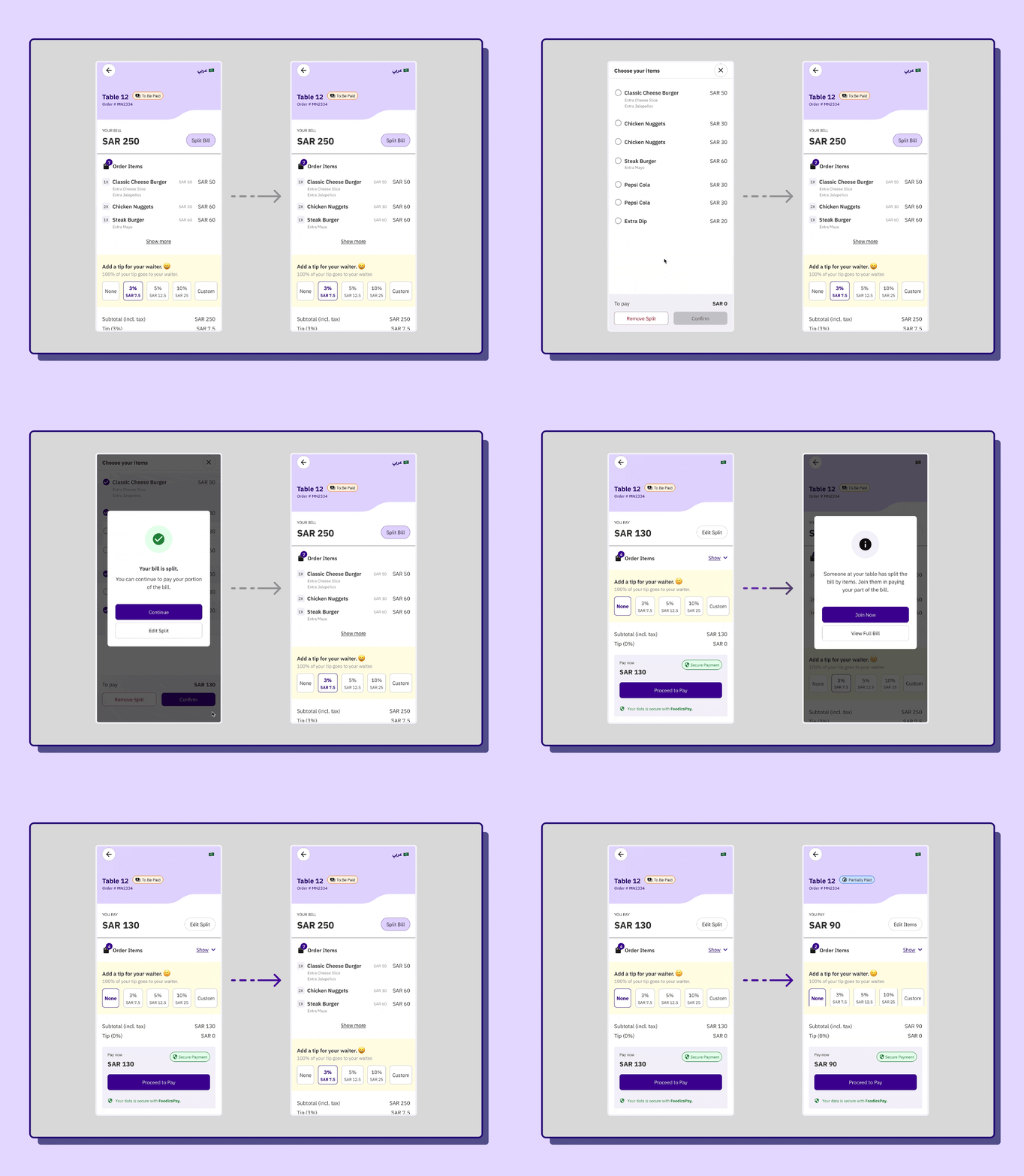
A major problem with other solutions on the market was overpayment. They don’t tell the rest of the table when someone has already paid part of the bill, so people end up paying twice over.
We solved it with real-time updates across every device viewing a bill. We worked with engineering on this immediately, and together landed on an architecture that syncs all instances live and posts updates between devices — without collecting any extra data from users. Whether you’re a group of 5 or 15, nobody overpays.
In your language
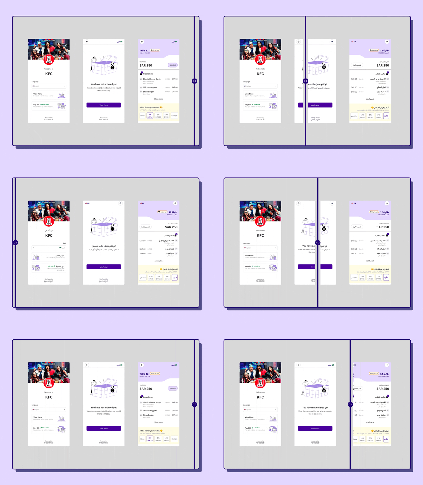
Our user base is diverse, and in our region the two most common languages are Arabic and English. We support both, and users can switch freely between them. Supporting a right-to-left interface — along with the component shifts it demands — was a worthwhile investment: we designed components to work in both languages, with alternates for the states that specifically need them in RTL.
Multiple devices supported
Screens keep multiplying — tablets, portrait and landscape, the outer screens on folding phones. We had to account for as many as we could. It was a genuinely interesting exploration of how new form factors create new complexity for UI design, and how much a designer now has to solve for.
Restaurant’s brand, integrated
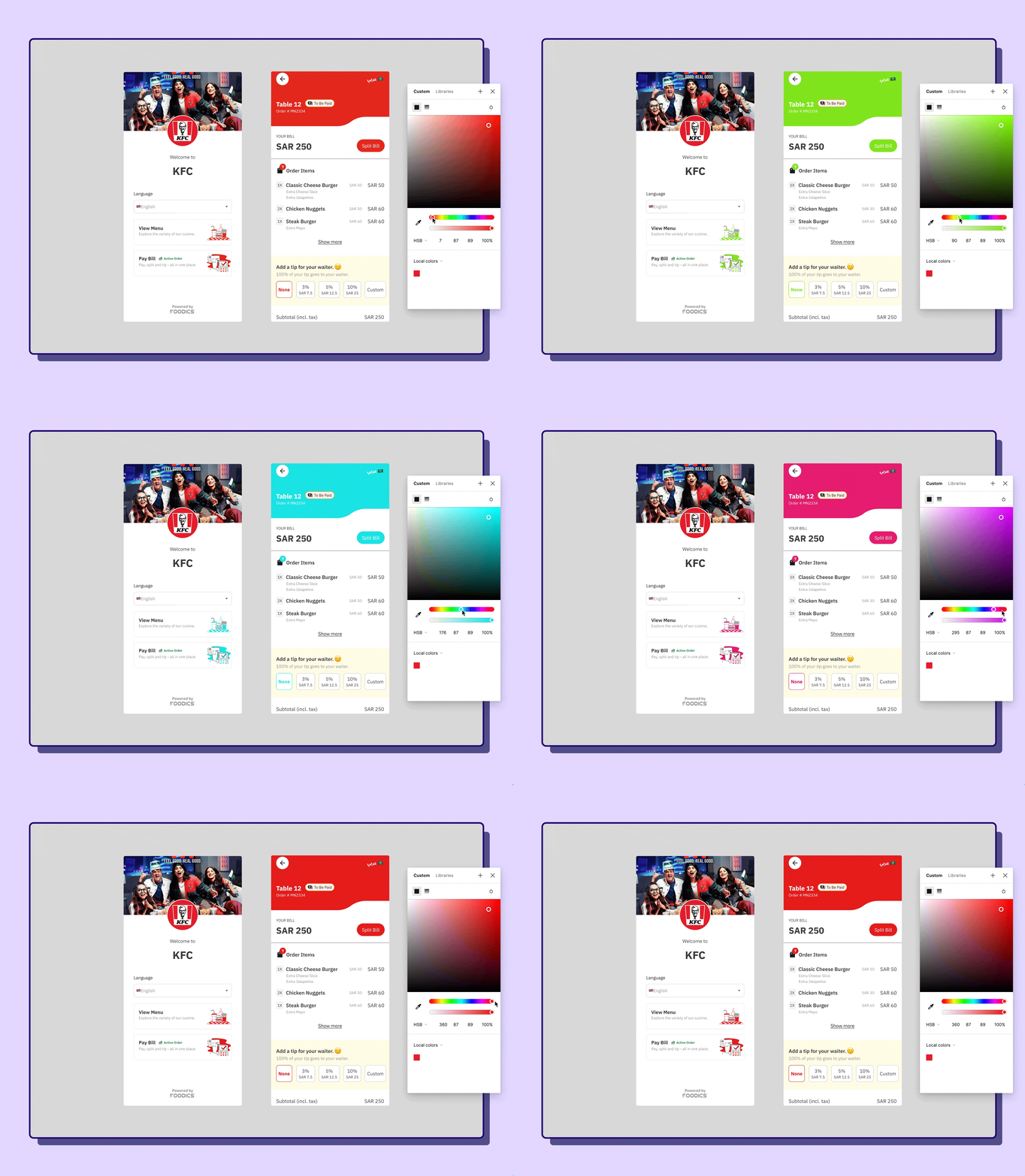
The experience is better when a diner sees that restaurant’s branding inside it. We gave managers control over their cover photo, logo, and brand colours in specific areas of the product, so it feels like their own. Using colour styles let us offer better customization while pinning down exactly where a custom colour applies — which also gave design and engineering the same language to work in, and made implementation easier.
Learnings
- Involve cross-functional partners early. People in other departments carry insights and experience of their own. Listening to their side of the story expands your understanding and builds a culture of collaboration.
- Test early and often, to counter the bias designers hold toward their own solutions. Watching people use the designs reveals how they’ll actually use them — not how you’d like them to.
- Design to scale. More features, requests, and updates are always coming, so the base has to be strong enough to carry the future picture.
Foodics is on a mission to design the future of restaurant management — but that isn’t complete unless we also care about every experience a customer has with that restaurant. Solving for the business means touching the experience of hundreds of diners across every kind of venue, from fine dining to fast service to a food truck.
This was our first step toward solving table payments. As we learn more from the release through behavioural research and field work, we’ll keep refining it.